Need a knowledge base like this for your business?
The Form Section
By Kim Dixon, MyPhotoApp Training Guru
Created: November 8, 2017, 7:10 pm UTC Last updated: February 19, 2019, 12:30 pm UTC
Creating A Customized Form
The Empty Form section gives you full creative control and lets you design your form exactly how you want to collect information from the users of your App, it can include a wide range of fields including images if you want.
There are probably too many uses to list but here are a few to get you started:
Contact form
Application form
Entry form
Booking form
Model release
Contract for signature
Order form
Model Rep Profile form
Session Client Details
Request Form
Testimonial / Questionnaire
1. Form Settings
Once you have added a form section to your App click anywhere on the form in the visual display or click the settings cog next to the form section to open the enhanced form settings menu.
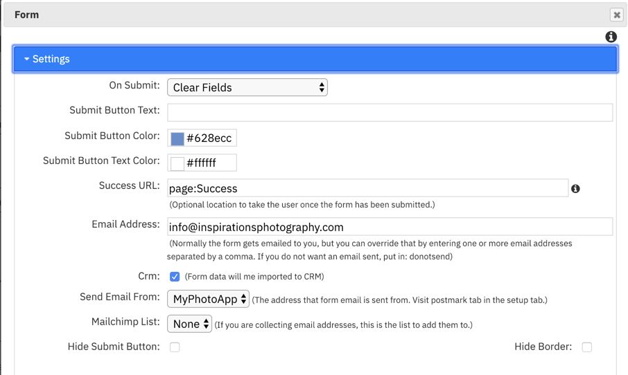
Click on the Settings Tab to choose what happens when the form is submitted.
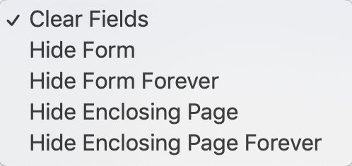
On Submit: You can choose from 5 options, the default selection is clear fields. Choosing hide form or enclosing page will apply to the device the form is viewed on and choosing hide form or enclosing page forever will hide the form form all future views.
Submit Button Text: Choose the call to action to add to the button, for example book now, submit, join or register.
Submit Button Color: you can change the default green to match your brand
Submit Button Text Color: choose a contrasting color for the button text
Success URL: by default a dialog message will be shown when the form is submitted but you can choose to create your own simply message or take them to a particular page with more information.
Email Address: by default this is blank and a form submission email is sent to the email address recorded in your account user settings. (This can be found on the Setup tab> User tab) . You can optionally choose to have it sent to an alternative address r addresses by separating them by a semi colon. this is ideal if you are creating an App for a third party.
CRM: You can now choose to have submitted forms automatically create a new client record in the CRM module by ticking the CRM box. Where no duplicate email or name exists a new record will be created on the client Rolodex.
NOTE: to automatically add new client records to CRM a minimum of an email and name field is required. In addition, to add additional information the form field names must exactly match the CRM field names. To find out more about CRM and form integrations click HERE
Send Email From: By default, emails are sent by MyPhotoApp but if you have linked a Postmark email account on the setup tab or set up the CRM module with email credentials you can choose to send the email from one of these instead of the default MyPhotoApp email option using the drop down list. Click the link below to find out more about setting up a postmark account. Postmark
Mail Chimp List: If you have set up a MailChimp account on the setup tab in the builder you can also link the form to a MailChimp list by choosing it from the drop down list. Click the links below to find out more about how this works.
Hide Submit Button: You can choose to hide the form submit button and optionally use a custom button. This is useful if you want to create a pay now button linked to PayPal. Once you have created your custom button you will need to add the following syntax - submit:formlabel where the form label is the name of the form section entered in the other settings
Hide Border: By default the form will have a thin line border around it you can tick this box to optionally hide it.
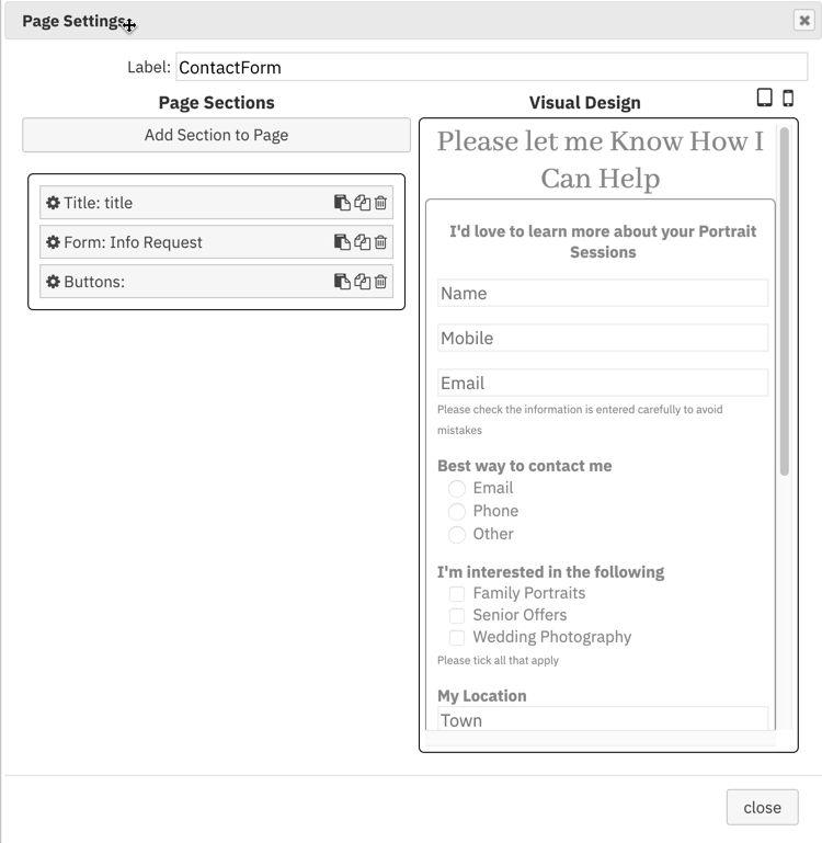
2. To Hide A Form
If you don’t want your form to be visible at all times in your App you will either need to go to other settings and set the display type to Hidden or add the form section to a page section instead of the home screen.
TIP: You will actually need a minimum of 2 page sections because whatever is added to the topmost page in an app also remains visible at all times.
In the example below the a Title section with the Call To Action and the request more information form is on the Contact FormPage below the HOME page.
3. Building & Customizing A Form
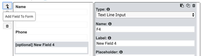
The Form Section is blank, you can also choose to start with a simple contact form and customize it. To add a new field to your form click the + symbol on the left-hand shortcut menu and then choose the field type from the drop-down list. New fields are added at the bottom of the form or below the last field, you updated since opening the form settings.
To select the type of field you want just click the arrow on the type box to display the field list and choose the type you want. You can then customize the field properties by adding your text and setting the options you want.
Custom Form Fields
Let’s take a closer look at the various fields you can add to forms and how to customize them.
Text Line Input
After you have added a form you can add new fields by clicking the + plus addfield to form symbol on the top left. By default, new fields are set as Text Line input which is the most commonly used filed. To change the field type, click the drop-down arrow to the right of the field type box and choose from the drop-down list. There are 13 different field types to choose from.
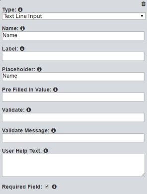
The text line input field allows users to input a single line of text it is suitable for collecting information such as names, telephone numbers, or a single line of an address or anything else that can be entered in one line.
Some of the options you can set for fields are the same for different types of fields, others are naturally specific to certain types. The options for the text line input filed are:
Name: When you add a new field, it is given a consecutive numerical name starting with F like this F11. This is the internal name assigned to the field that will be used for the column headings for the CSV data extracts when viewed on the Form Data Tab or downloaded and in the emails you receive when a client submits the form. You can change this to something more meaningful for the information the field is intended to collect such a name.
Label: This is also automatically assigned according to the numeric name e.g. New Field 11. The label is optional and is displayed above the field on the form you can either clear the text or replace it with your own. This is useful for adding headings or brief instruction.
Placeholder: This allows you to add example text or further information that will be displayed greyed out on the form as a prompt to help users fill in the field.
Pre-Filled in Value: You can add a pre-filled in value that will be displayed in the filed on the form, for example, a currency symbol where the field is intended for a monetary value.
Validate: This option allows you to enter something called a regular expression that can be used to validate that the data entered matches the expected format, for example, a telephone number or date. It works in a similar way to the data format codes you may have used in spreadsheets. Click the ‘i’ next to validate to find out more about regular expressions. Just leave blank if not required.
Validate Message: When validation fails this is the message that will be displayed. If you have added a regular expression for the validate option enter the text message you wish to display here for example “please enter the date in the following format only 30 10 2017”.
User Help Text: You can add text here as instructions that will appear on the form to help the user to fill out the form properly.
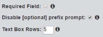
Required Field: Click the box if this field must be completed.
Text Box Input
The Text Box input field is similar to the Text Line input but does not include the validate option and allows users to input multiple lines of text. You can define the number of lines the text box should have at the bottom of the Field menu.
When not set as a required field you can disable the optional prefix from being displayed on the form. A text box input field could be used to collect Any questions or other information.
Checkbox
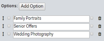
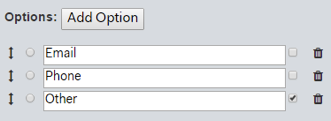
The checkbox field allows you to create a list of options for users to select. They can select multiple options on the list you create by ticking the box next to the items they wish to choose on the form. Click Add Option to add an item to the list and type in the text to describe it. You can delete an item you no longer want on the form by clicking the trash can next to it. For example, this could be used for people to choose which areas of photography they want further information on.
Radio Button
The radio button field allows you to create a list of options that are mutually exclusive, the user can only select one item from the list. This is useful where you want people to make a definite choice. For example, it could be used for the user to select how they prefer to be contacted.
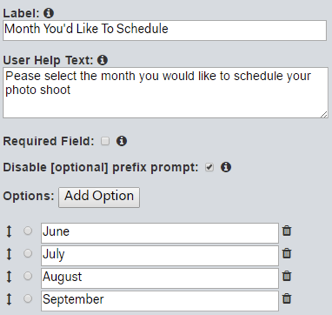
Select Dropdown
The select from drop-down field essentially performs the same task as the Radio button field in that it allows the user to only choose one item from the list. But this time they make their selection from a dropdown list.
This is useful if you have a long list or just want to keep the length of your form more manageable. In the example shown here, I have used it to ask when someone would like to schedule a photo shoot.
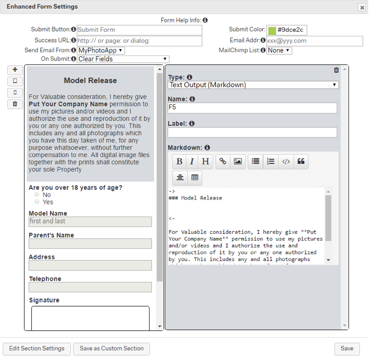
Text Output (Markdown)
The is one of the most powerful fields you can add to a form as it allows you to display a variety of different outputs on a form.
You can add a variety of text formatted exactly how you want using a combination of the toolbar options and markdown formatting. But it doesn’t stop there as you can also add a hyperlink, bullet point or numbered lists, HTML code, an image, a quote or a table. In fact, almost anything you want. Use it to create a contract, model release or terms and conditions for a booking form. Add a signature filed and you not only have the means to deliver them digitally to clients via an App but to also receive a signed copy back via email when they submit the form.
The mpa.modelRelease shared template that you can find in the Template Bazaar the new Model release section are both excellent examples of the text output field in use as shown below.
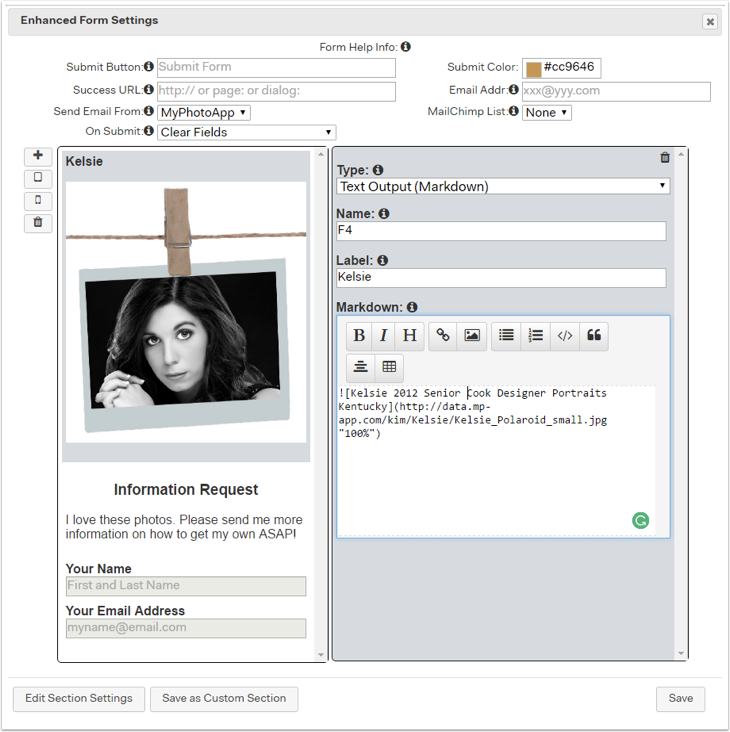
This is an example of how you can add an image in a form this could be your logo or some other design element. You could even add a number of images in separate text output fields if you want so people can choose from them.
Click the link below to find out more about how to add images to your forms.
How to add a picture to a form
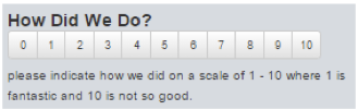
Net Promoter Score
The net promoter score field allows you to add an NPS input, this is useful for customer satisfaction surveys.
The user is asked to choose a rating from 1 – 10 for something. Popular uses would be to rate the email communication, booking system or some other client experience.
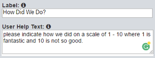
Use the label text to ask the question and add the user help text to explain how the rating works in more detail as in the example shown on the right.
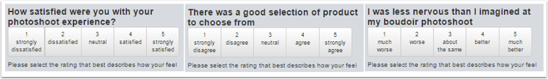
Likert Scale
This allows you to add a conventional Likert scale for users to input their choice. Likert scales are mostly used in surveys. You can choose from 2 different Likert scales, satisfaction, agreement and Goodness. Again, you can use the label to define the question and add help text with instruction.
Signature
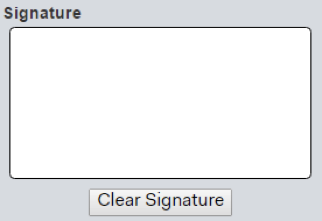
The signature field lets the user sign the form. Very useful for model releases, contracts application, booking forms or any form where you require the signature of the person submitting it or perhaps a parent if the form is being submitted by someone under 18 years of ages, such as a Senior rep application form. You can add a label, help text and set it as a required field. This is what it looks like in the app:
Email
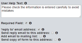
The email field is similar to a Text Line Input field, but it automatically validates that the input looks like a valid email address and is, therefore, the one to use if you want to collect emails.
It’s a good idea to add some user information to remind people to check they have entered their email correctly as the validation does not detect typos!
It’s a good idea to make an email field a required one. You have a few additional options to tick for this field.
Reply to email address: Normally, when form submission emails are sent to you, they will come from support@myphotoapp.com and be recorded on the Form Data tab in the builder. Where you can download form data as a CVS file.
When this checkbox is ticked, they will come from the email address entered in this field by the person submitting the form. This means you can respond to the form submission email you receive using Reply, and it will automatically be addressed to the email submitted on the form.
Send reply email to this address: Tick this box if you have added a client reply email field to the form and it will be sent to the email address entered in this field.
Add email to mailing list: Tick this box to automatically add the email address entered to a MailChimp list you have associated with this Brand on the Brand Set up Tab and linked to this form above.
Send copy of form to this address: When ticked a copy of the submitted form will also be sent to the email entered in this field.
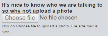
Image
The image field lets users upload an image to submit along with the form. This would be useful for an application form, submitting a photo of a receipt or other document or perhaps a photo contest entry. You can add a label, help text and choose whether to make this a required or optional field. All the user has to do is click on the Choose file button and select an image file that is less than 1mb in size.
Liked Images
This is a hidden field that is not displayed on the form. When the form is submitted, the names of any gallery images that have been liked by clicking the red heart icon, will be submitted along with the form. There is an example of this in the submit favorites templates that can be found in the Template Bazaar on the Template Tab.
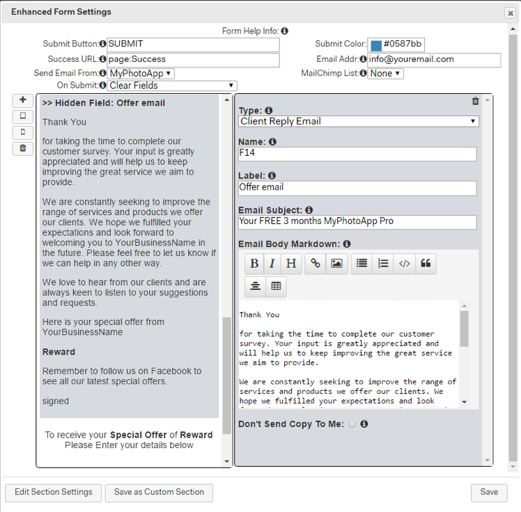
Client Reply Email
This is a hidden field and not displayed on the form. When the form is submitted, the text you enter in this box is emailed to the user. This uses markdown syntax so you can create pretty emails.
The testimonial and survey templates found in the Template Bazaar both have an example of a client reply email field.
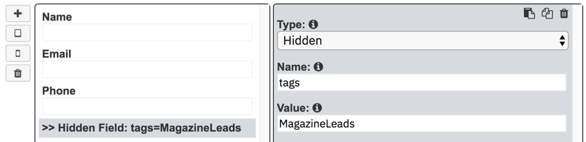
Hidden
The new Hidden field is designed to use when you have chosen to import submitted form data into the CRM module as new client records. It allows you to add an unseen keyword tag that will also be added to the client records that you can later filter the client Rolodex by, for example, MagazineLeads or SRep2018.
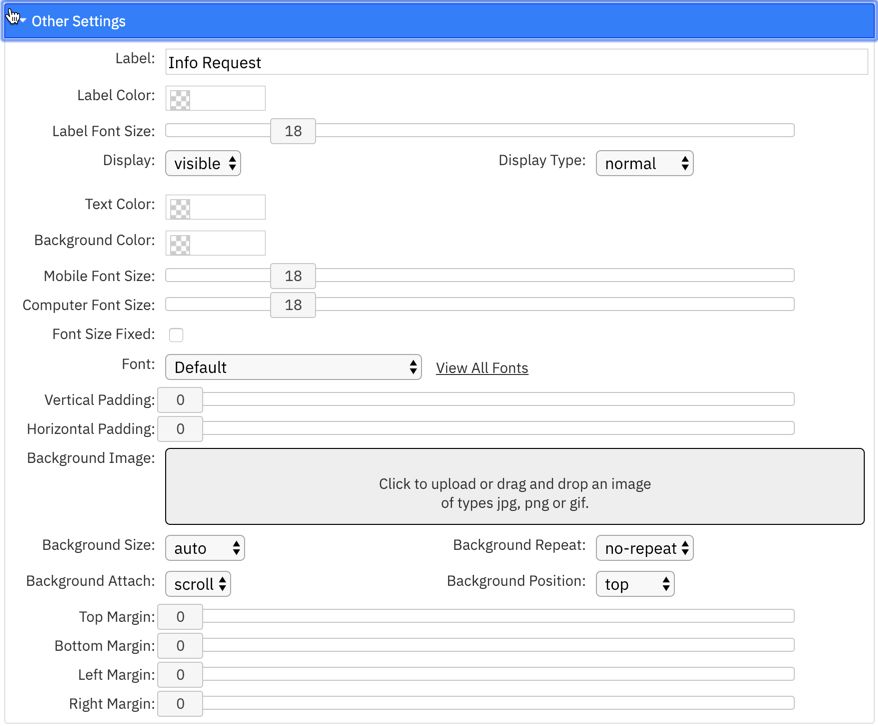
4. Other Settings
This is where you enter the label for the form section and can choose other settings that affect the look, positioning and behaviour of the form. you can choose to use an accordion heading and hide the form add padding or a background image and choose the form font here.
Once you are finished click OK to save your form.
5. Important Things To Remember About Forms
There are few things you need to take into account about how Forms work:
You can reorder fields in your form by drag and drop just click on the field you want to move and drag it to the position on the form you want and repeat for all section. Remember if you have made changes to your form you will need to republish the App in order for them to be applied.
Forms work instantly when mobile devices are connected to the internet and form data is automatically saved on the device when no internet connection is available and synchronized with your MyPhotoApp account when an internet connection becomes available.
The form data is sent to you via email and stored for 90 days on the MyPhotoApp Server. You can access the data from the form data tab where it can be downloaded as a CVS file.
While apps continue to work if you stop subscribing to MyPhotoApp, forms are no longer emailed or stored on the server.