 |
Need a knowledge base like this for your business?
How Can I Make A Background Image Appear To Scroll?
| By Kim Dixon, MyPhotoApp Training Guru Created: December 16, 2016, 1:37 pm UTC Last updated: September 3, 2017, 2:43 pm UTC |
A big web design trend at the moment is parallax scrolling - a technique in computer graphics and web design where the background image moves at a slower rate than foreground content, creating an illusion of depth in a 2D scene as you scroll down the page and adding to the immersion. It a sort of 3D effect. It can sometimes be overwhelming, but when used sparingly it can provide a nice, subtle element of depth.
MyPhotoApp has a Parallax section type available from Pro subscription level up, but here is another way you can mimic a scrolling background by using a fixed background on a section. This effect works with any section but works really well on a button section because more of the background image will be visible behind your button. The effect will ONLY appear when the App is viewed on a PC at this time due to limitations in mobile browsers. But as with full-screen Apps, its looks awesome when viewed in this way. Here is how to add this cool feature to your Apps:-
- Choose which section you want to create your scrolling background effect in and open the section settings by clicking on it in the visual design or on the settings cog in the Layout sections. I'm using a standard button section in the new 3rd party App template.
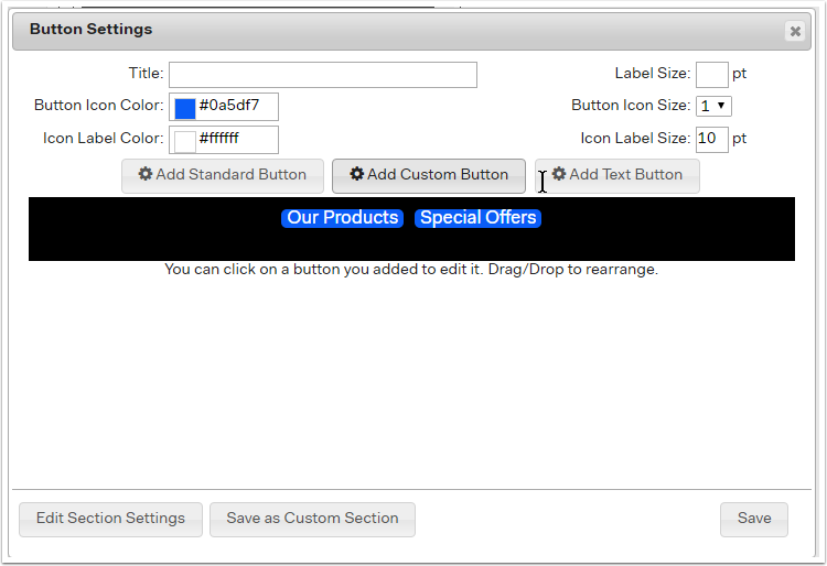
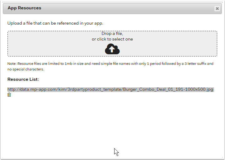
- Click on Edit Section Settings, the first thing to do is upload the background image you want to use so click on App Resources to do this. When the upload is completed the image URL will appear below, highlight this and hit CTRL (CMD) + C to copy it and then click the cross in the top right-hand corner to close App resources and return to the Section Settings menu.
- Click in the background URL field and press CTRL (CMD) + V to paste the image URL. Now change the background attachment setting from Scroll to Fixed using the drop down arrow.
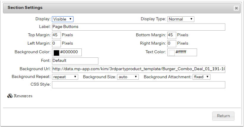
- So you will be able to see more of your image it's a good idea to increase the size of your section by adding a margin all around. I'm going to add a 45px margin to the Top and Bottom of the section. Click Return.
- You will get a preview of how your background is going to look. Remember the size, as in the height of your background image will determine how large your margin needs to be, the margin needs to be large enough for a decent amount of your image to show about a Third but small enough for the scroll effect to show as you move down the App in the browser.
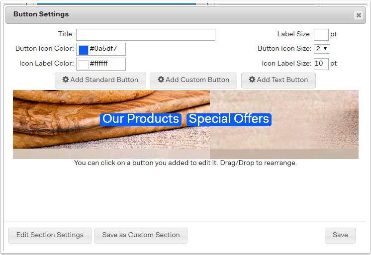
- Click Save to update the section settings and return to the main builder. Fixed backgrounds may look a little weird in the builder and you won't see the scrolling effect, but they will look great in published Apps so don't be put off. This is because fixed backgrounds are tied to the browser viewport and you won't be able to see the full effect until you publish and check out your App.
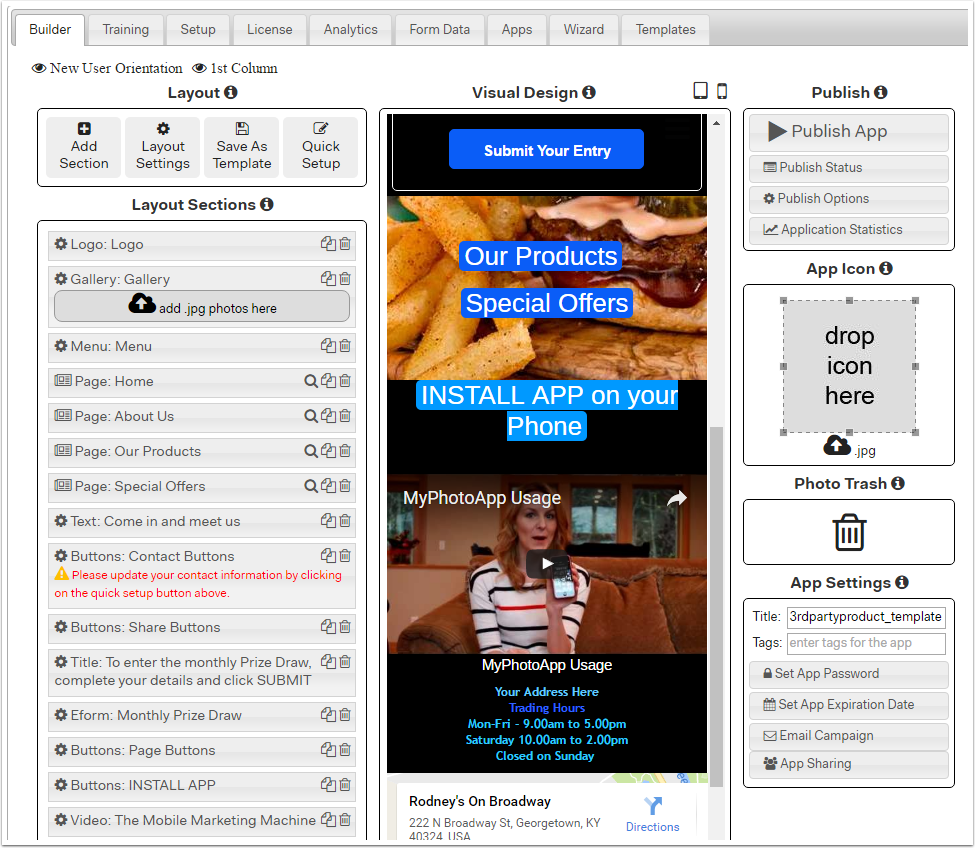
- Click PUBLISH to update the App and check out your changes by clicking the App URL link. If you want to adjust the size of the section or make any other changes just repeat the above steps until you are happy with how it looks.
Remember this is an effect best used sparingly so if you want to add more movement to your App why not add a Gif section to your App as well?
Here is a link to a multi-page App created by Tim Hensel that uses this effect and also has a great example of how to use a gif in your Apps. Enjoy.
Key words - scrolling background -