 |
Need a knowledge base like this for your business?
The New Columns Section
 | By Kim Dixon, MyPhotoApp Training Guru Created: July 24, 2017, 4:20 pm UTC Last updated: August 30, 2017, 4:33 pm UTC |
The new column section allows you to create feature rich tables, with the added benefit of being able to control how the information is displayed on different devices.
Once you have added a new column section click on the settings cog and add your first column by clicking the Add Column button. Columns are automatically labeled with consecutive numbers starting with #1, you can change the order of columns by clicking the 4-way arrow to drag and drop the column you want to move when you save the changes the columns will automatically be renamed consecutively next time you open the column section.
Flow Width - The flow width setting determines whether or not the columns will be split on smaller screen devices - leaving it blank will keep them together. For example, 600px will result in columns being split on an Apple iPhone.
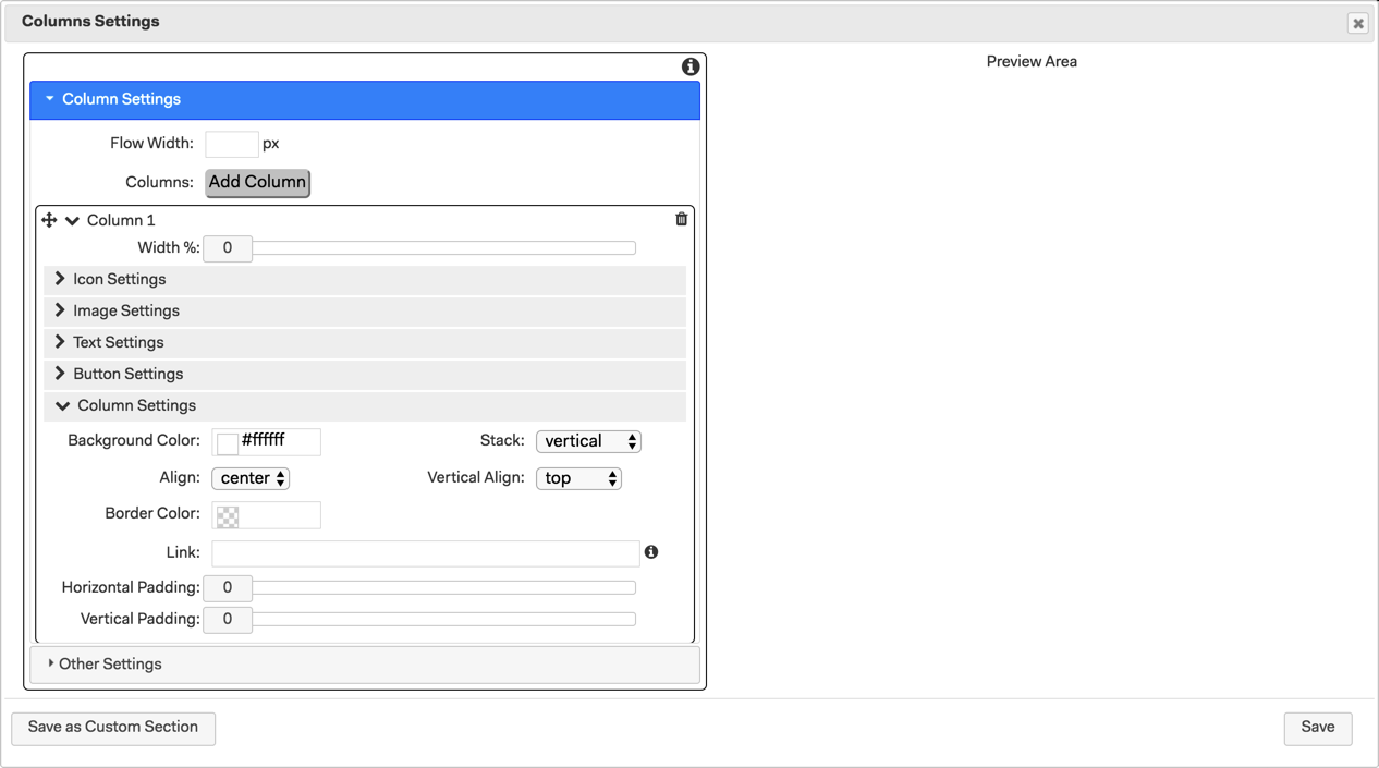
Width - Set the column width according to how many columns you are going to add and how much space you wish to allocate each column out of 100%. Whilst there is no maximum number of columns you can add you should bear in mind the practicality of the table you are creating and how it will work on varying size devices. Too many columns will result in a cluttered appearance unless they contain a minimal amount of information. Ideally, 2-4 columns generally work well.
You can add any or all of the following types of information to a column: Icon, Image, Text and Button. Content can only be added in this order as it is not possible to change the order of the different content types.
1. Icon Settings - To add an Icon at the top of the column click on Icon Settings and click to select an Icon. On mobile devices, a direction arrow could be used to indicate whether people need to scroll down or swipe to the side to view information in additional columns.
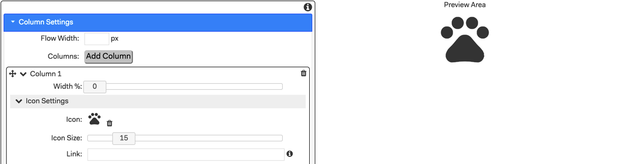
Icon Size - Use the slider to adjust the icon size.
Link - You can add a link to another section, page or another resource.
2. To Add an image click on Image Settings and upload an image.
Link - You can add a link to another section, page or another resource.
3. Text Settings - you can specify a fixed font size. That will set the font to a particular Point size across devices and let the devices figure out how best to display it so you get a more uniform look for your App regardless of how you view it.
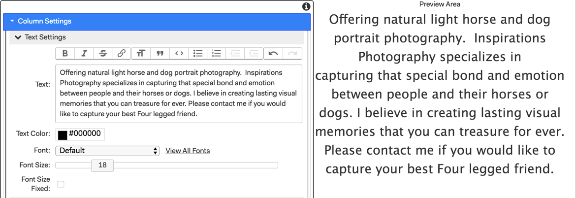
Text - Enter the text and choose your formating options from the text editor toolbar.
Text Colour - Use the color picker to choose a color or enter the hexadecimal # to match your Brand color scheme.
Font - Choose your font by scrolling down the list or by starting to type the font name. Your frequently used fonts will appear at the top of the list.
Font Size - Adjust the font size generally size 16-18 works well for body text.
Font Size Fixed - Ticking this box specifies a fixed font size and sets the font to a particular Point size across devices and let the devices figure out how best to display it. This is recommended to help keep your layout proportionally sized across devices.
Whilst there is no limit on the amount of text you can add you should remember readability and ease of scrolling are key to successful Apps.
4. Button Settings - Finally, click on the Button settings to add a Button you can choose to have text, an Icon or both. If you choose both the Icon will be positioned to the left of the text and will resize with the text size selected.
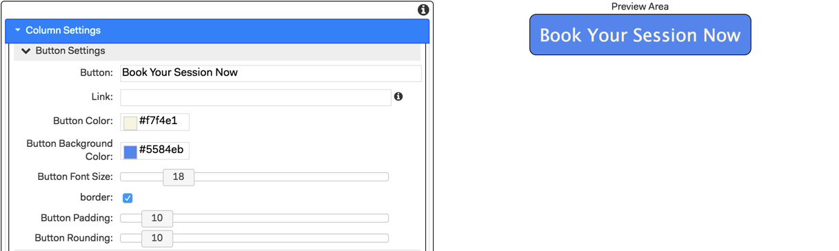
Button - Type in the Call to Action text you want for the button.
Link - Add a link to the button, for example to the booking form page in the App.
Button Color - This sets the color of the Button Text. Use the color picker to choose a color or enter the hexadecimal # to match your Brand color scheme. The default is white.
Button Background Color - Allows you to set the button background color - the default is black.
Button Font Size - Adjust the size of the text font and icon size.
Border - Tick to add a black line border around the Button.
Button Padding - Slide to the right to add more padding around the text in your button, this will increase the size of the button background. I find a setting of 10-20 looks good.
Button Rounding - Slide to the right to increase the amount of rounding applied to the Button.I find a setting of 10-20 looks good.
5. Column Settings -
Background Color - Set a background color for the individual column.
Stack - When you have more than one type of content in a column, e.g. an image and text, you can choose how you want them presented; side by side (horizontal) or in a vertical column. The default setting is vertical.
Align - Set horizontal alignment, center, left or right for column content.
Vertical Align - Set vertical alignment, top, middle or bottom for column content.
Border Color - specify a color, other than the section background color, to add a border to your column.
Link - Add a link to another section, page or external source.
Horizontal & Vertical Padding - Adds a border to the column on the sides and/or the top and bottom.
6. Other Settings - You can leave most of these options at the default setting.
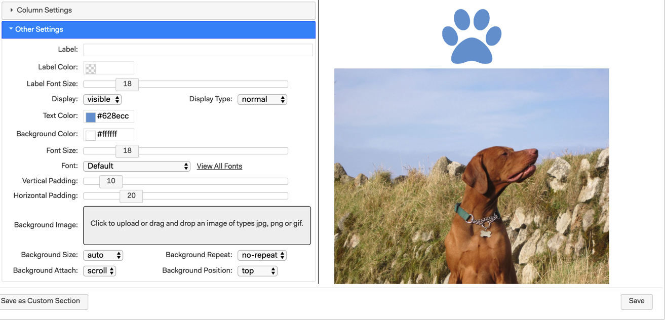
Label - Add a label to easily identify your column sections in the Builder Visual Design
Label Color - This is the color the section label heading will be if you choose the Accordion display type.
Label Font Size - This is the font size the section label heading will be if you choose Accordion display type.
Display - choose whether your columns will be visible in the App when opened or hidden until the viewer does something such as clicks a button, heading, picture etc.
Display Type - leave as normal or choose Accordion to open from the label heading in App.
Text Color - Not only does this set the color of the text used in the column section it will also change the icon color from the default black.
Background color - Choose a background color or and add some vertical and horizontal padding.
Vertical & Horizontal Padding - Adds a border to the table you create in the column section on the sides and/or the top and bottom.
Background Image - If you want to add a custom background to make your column content stand out you can upload a background image here and choose the background settings you want below.
Once you have finished adding columns and content click Save to update the column settings. You can test how the columns will look on smaller screens by resizing your browser window while viewing the published App.
There are many uses for columns in Apps, such as pricing guides, product info, schedules, about info, menus, session guides and lots more.
Check out the Template and Masterclass Tabs and the Facebook group for inspiration on using columns.
Here is cool Pricing App from one of our members that uses the new column sections in a number of ways:
http://m.mp-app.com/masterclass/KarenStauffer