 |
Need a knowledge base like this for your business?
The Hero Section
 | By Kim Dixon, MyPhotoApp Training Guru Created: July 24, 2017, 4:28 pm UTC Last updated: August 30, 2017, 2:46 pm UTC |
The Hero section is designed to create an eye-catching App header, that can contain a Logo, Title, Button and Block Section. It's basically a ready-made group of sections that work together with a background 'Hero' image that will look great on any device - even a 27” computer screen. This makes it an ideal alternative to a simple LOGO section for your business and marketing Apps. It expects the App to display full width on a computer. It has a full screen fixed background that does not move when the display > 1000 pixels but scrolls when the display is < 1000 pixels.

The example above has a rose background image, a Logo - Blush Boudoir, a Title - 2017-2018 and a Subtitle PRICE GUIDE positioned below that and a Text Button LEARN MORE with a border.
After you have added a new Hero selection to your App click on the settings cog to get started:-
1. The first thing you need to do is add the essential Hero IMAGE, as the section won’t work without one, click on Image Settings to expand it and upload the Hero image you want to use. A standard 3:2 aspect ratio works well with 2048 px on the long side. I have created this image with white space to position the Logo, Title and Button content on.
Label - Adding a descriptive label for the section makes it easier to work with sections in the visual display.
Height - Reducing the height has the effect of cropping the image horizontally so less of the image you have uploaded will be displayed. The image remains centered as the height is reduced equally from the top and bottom.
Fill - The Fill setting allows you to add white or black fill a value of 100 adds none, moving the slider to the left to reduce the value and increases the level of white fill and has the effect of fading the image as in the examples above with a fill value of 60. Correspondingly moving the slider to the right increases the value and adds black fill and darkens the image as in the example below.
The other settings are all optional - you can use all of them or just the ones you want.
2. Click on Logo Settings to expand it and upload your Logo, you can use a Jpeg but a Png file works really well as the transparency allows your hero image to show through. You could even use an animated Gif for added impact. There is a limit of 15mb for the logo file size.
Vertical Position - Use the slider to position your logo where you want it.
Horizontal Position - Adjust the horizontal position, zero will center the logo.
Logo width - Adjust the width of your logo to suit the background image, 100 will display the logo at the actual file size.
Logo Background Color - If you have used a png file you can add a background color, that will show through, to help make your logo stand out.
Logo Background Opacity - Adjust the background color opacity.
Logo background Padding - Adding padding allows you to add a border of the background color to the logo.
Logo Link - Add a link to your logo for example to your website or another section or page in the App - http://www.yourwebsite.com
3. Next click on the Title settings to add a Title and a Sub Title if you want. The settings are laid out in a similar way to the Title Section.
Title - Type in the title text.
Font Size - Adjust the font size 20-22 works well for a heading.
Text Color - Type in the hexadecimal color to match your brand color scheme or choose from the color picker. The color applies to both the Title and Subtitle.
Font - Choose your font by scrolling down the list or by starting to type the font name. Your frequently used fonts will appear at the top of the list.
Bold and Italic - Tick the boxes to choose these settings for the Title.
Title Border - Tick to add a line border around the Title and Subtitle.
Vertical Position - Choose the vertical position of the Title.
Horizontal position - Leave at zero to center the Title or adjust the slider to position the Title where you want.
Title Width - Slide to adjust the width of the Title and the Border.
Title Fill - Adds a white or black rectangular fill behind the Title & Subtitle according to the title width set. A value of 100 adds none, moving the slider to the left to reduce the value and increases the level of black fill and moving the slider to the right increases the value and adds white fill.
Subtitle - Type in the subtitle text.
Subtitle Font Size - Sets the font size 16-18 works well for body text.
Bold and Italic - Tick the boxes to choose these settings for the Subtitle.
4. Finally, click on the Button settings to add a Button you can choose to have text, an Icon or both. If you choose both the Icon will be positioned to the left of the text and will resize with the text size selected.
Button - type in any text you want for the button.
Button Icon - Choose a button Icon
Link - add a link to the button, for example to your home page like the example below.
Button Font Size - adjust the size of the text font and icon size.
Button Color - Allows you to set an individual color for the button text and icon.
Vertical Position - Choose the vertical position of the Button.
Horizontal position - Leave at zero to center the Button or adjust the slider to position the Button where you want.
Button Width - Slide to adjust the width of the Button and the Border.
Button Fill - Adds a white or black rectangular fill behind the Title & Subtitle according to the title width set. A value of 100 adds none, moving the slider to the left to reduce the value and increases the level of black fill and moving the slider to the right increases the value and adds white fill.
Bold and Italic - Tick the boxes to choose these settings for the Button.
Border - Tick to add a line border around the Button.
Animate - Tick to apply animation to the Button so that when people mouse over the button it will change black text with a white background.
5. The last option is to add a Block by ticking the box Vertical Position -
Vertical Position - You can adjust the position of the Block over the Hero image to help make the text or buttons more visible.
Horizontal Position - Leave at Zero to center the block on the Hero image.
Block Width - adjust to the width you want
Block Height - adjust to the width you want
Block Fill - Adjust the Fill by moving the slider to the left to reduce the value and increases the level of white fill or by moving the slider to the right to increase the value and the amount of black fill.
6. Other settings - To get the full effect from the Hero section you need to leave most of these options at the default setting as it wouldn't be appropriate to change the display setting or background image settings. If you want to add a plain background border around your Hero Image you can choose a background color and add some vertical and horizontal padding.
Click Save to apply your settings.
If you are creating a multi-page Apps adding a Hero section at the top of the App on the Home Screen or root of the App will ensure it is what people see first when they open the App as anything on the home screen or top most page will be visible in the App when opened. By putting it on the Home Screen it will also be visible when you view each individual page in the App.
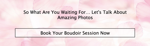
As well as making a great App Header the Hero section is also a great way of creating a custom image separator to organize the content in your App with the added advantage that you can add a Button with a call to action on it like this.
Check out the Masterclass Tab for a great video on how to create a Pricing App for a step by step guide to using the Hero Section.