 |
Need a knowledge base like this for your business?
Menu+ Section
 | By Kim Dixon, MyPhotoApp Training Guru Created: July 24, 2017, 4:32 pm UTC Last updated: September 10, 2017, 1:47 pm UTC |
The Menu+ section provides an enhanced menu display with the option to add a Logo Image and control the menu size and color option together with the ability to be displayed as a horizontal menu on larger screen devices.
The menu is displayed in two ways depending on the settings selected:
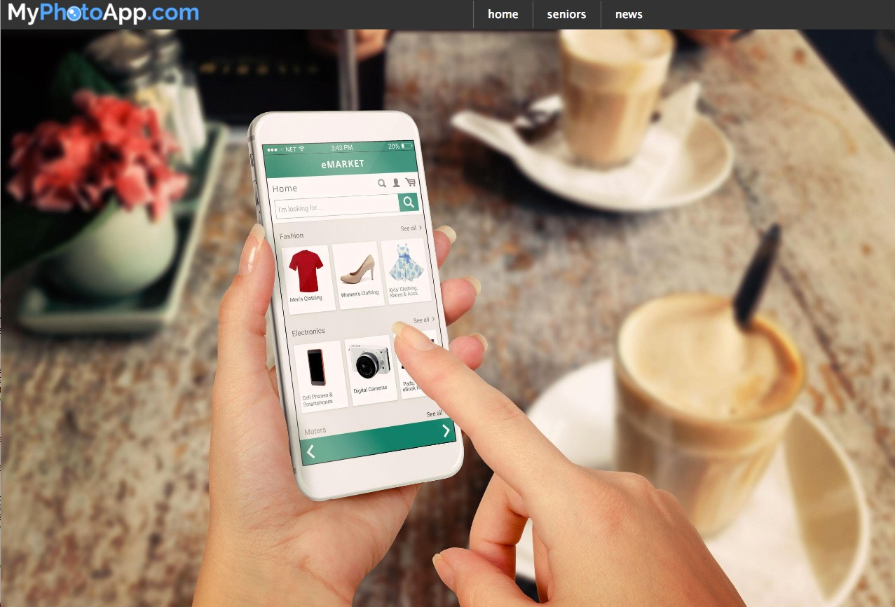
1. Horizontal Menu Bar - When the App is viewed on a large screen device such as a computer or large tablet with sufficient room to do so the main Menu Items will be displayed as a horizontal menu bar in the following format:
Logo Image menu1 menu2 menu3 menu4 menu5
Where menu items 1-5 are the Top Level Menu items which can optionally have drop-down sub menus associated with them.
The position of the Horizontal Menu Bar in the App is determined by the location of the menu+ section in the layout sections in the Builder. This allows you to choose where it will appear for example under a main logo or hero section. So if you want it to display at the top of the App you will need to drag the Menu+ section to that position or wherever you want it to be shown.
When you are working with multi-page apps you will need to decide where you want the menu to appear, at the top of every page or just on the home page? If you want it to appear on every page you will need to add the menu+ section to the home screen (root) of the app and if you want it to appear only on the home page you will need to add at the top of the home page section.
The image below shows an example of the Menu items displayed as a Horizontal menu at the top of the App on a large screen device.
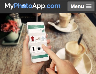
2. Menu Button - When the App is viewed on small screen mobile devices with a screen size that is less than the Collapse width specified the menu items will collapse and a standard Mobile friendly Menu Button will be displayed. The Menu items are then revealed by tapping the Menu Button. By default, the Menu Button is always displayed at the top of the App regardless of the position of the Menu+ section. Here is an example of how it looks when the menu is displayed as a button and the menu hasn't been opened yet.
To set up the menu+ section click on the setting cog to open the Menu Settings to select the options you want, the image below shows the default settings for the Menu+ color scheme.

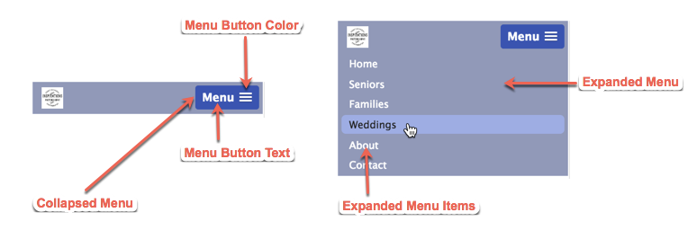
As you can see most of the settings are for the different elements of the menu+ section that you can specify a color for. Here is an example of the menu+ displayed as a horizontal bar menu on a computer with the different elements labeled.
And here is an example of the collapsed menu+ with the Menu Button as it is displayed on a mobile device and how it looks when you click on the Menu Button to expand it with all the different elements labeled.
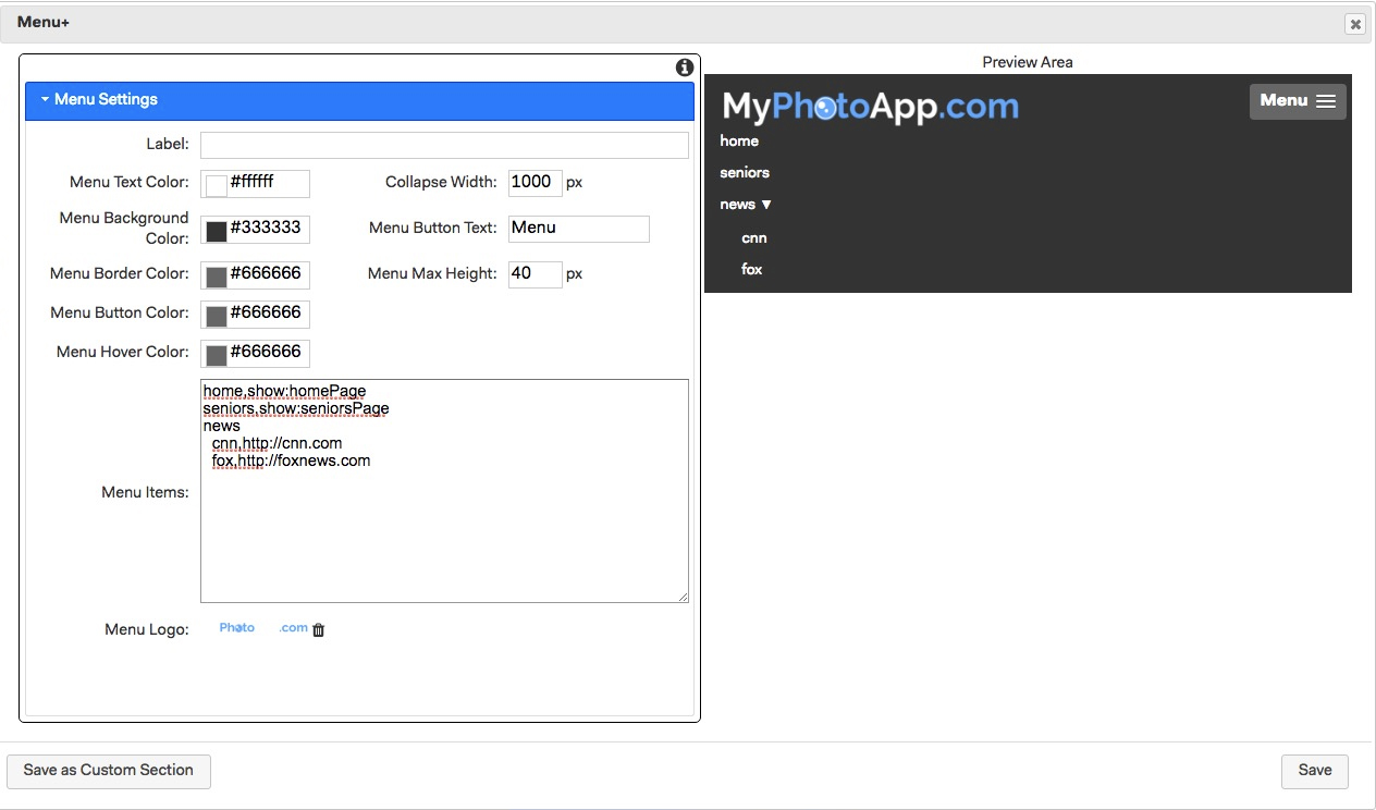
And here is a screen shot of the menu+ settings showing the various color settings for the examples above. I have included the Layout Sections so you can see the labels for the different pages I have added as menu items so you can see how the menu items have been added.
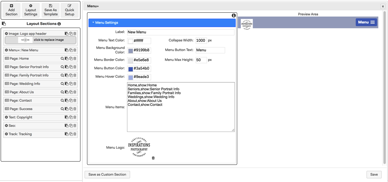
Label - As with other types of sections, this is the label that appears on the section in the layout sections in the builder, enter a label to identify the section.
Menu Text Color - This is the color used for all menu text. By default, this is White click to change it using the color picker or by entering the hexadecimal number for the color you want.
Menu Background Color - This is the color the horizontal menu bar will appear when displayed on wide screen devices. By default, this is dark gray click to change it to a color to match your Brand or App.
Menu Border Color - This is the color used for the vertical lines shown in between the top level menu item buttons when displayed as a horizontal menu. By default, set to a mid gray, click to change it to a color to match your Brand or the App.
Menu Button Color - This is the color used for the menu Button displayed on narrow devices. click to change it to a color to match your Brand or the App.
Menu Hover Color - This is the color menu items change to when you hover over them to highlight them. By default, set to a mid gray, click to change it to a color to match your Brand or the App that will work with the other colors chosen.
Collapse Width - You control when each type of menu is display by specifying the collapse width in Pixels. When the device display is narrower than the collapse width set the menu will be displayed as a button. A collapse width of 1000 px will usually work well.
Menu Button Text - This is the Text label displayed on the left of the menu button that will be used on narrow devices. You can leave it blank if you do not want any text to be displayed.
Menu Max Height - This sets the maximum height for the horizontal menu bar by default it is set to 40. If you have chosen to add a logo to the menu you may want to enter a slightly larger size of say 60-100 to suit the display of your logo.
Menu Items - Unlike the standard Menu Section pages are not automatically added to the Menu+ section this gives you total control of how the menu is laid out and what is included in it. You will need to specify each menu item with the relevant syntax for the pages, sections and links you want to be on the menu.
The format for a single menu item is: DisplayName,link
Where the DisplayName is what will be displayed on the Menu, and the link is where you are taken when the menu item is clicked. The Menu link follows the normal MyPhotoApp linking convention and can be a URL - http://xxx.yyy or a link to a page - show:pagename or section show:products or any other link. The DisplayName and the link are separated by a comma.
Here is another example of a single menu item: Home,show:HomePage
This will display Home on the menu+ and when people click on the Home menu item, it will show the page that has the label HomePage.
Each line in the menu items text area creates a distinct menu item. Items entered without any indentation will be the Top level Menu Items shown on the Menu.
Unlike the standard menu section, you can have unlimited sub menus in a Menu+ section. To specify a sub menu, you simply need to indent the item by adding a number of spaces on the front of it, how many spaces you indent is up to you. The number of spaces you choose to prefix sub menu items with isn't important, but it needs to be consistent in order for the Menu+ section to know whether it is a new or existing sub menu level. All menu items you want at a particular sub menu level MUST be indented by exactly the same number of spaces.
In the image below, you can see that the Top level menu items are: home, seniors and news. News has a sub menu of cnn and fox.
Menu Logo - You can add a logo to the Menu drag or click to upload a jpg, png or gif image. A small logo will be displayed on the left-hand side of the menu on all devices as shown in the examples above, where the MyPhotoApp logo has been added. This feature allows you to do away with the traditional logo section or alternatively create your own custom Menu icon to display on the Menu bar like this.
If you choose not to add a Logo to the menu the menu items will be displayed on the left-hand side of the Horizontal menu Bar when viewed on wide screen devices.
When you have finished click save to close the menu settings.
NOTE: You can only have one menu section in an App.