 |
Need a knowledge base like this for your business?
Pop-up Section
 | By Kim Dixon, MyPhotoApp Training Guru Created: October 24, 2017, 9:39 pm UTC Last updated: February 19, 2019, 12:16 pm UTC |
The new pop up section is designed to allow you to deliver a message, special offer or other invitation to people checking out your app. This is great if you have an information app your send out in response to inquiries and want to prompt people to get in touch or take up a special offer.
It works in a similar way to the welcome section but with a few key differences:
1. The Popup appears in one of 2 ways:
- After x number of seconds when you tick the timer box and specify the time, the default is 10 seconds or
- Manually when a button in the App with a call to action is pressed.
2. Unlike the Welcome section, the user is not forced to do anything and can choose to close the dialog by pressing the black cross at the top if they want to decline to fill in their details.
Setting Up Your Pop Up Section
After adding your Pop-up section click on the settings Cog to beginning setting up your Pop up by choosing the basic pop up settings.
Note: It won't matter where the section is located in the app as the popup's position is controlled by the settings you choose.
There are six menus within the Popup settings:
1. Popup Settings
The main popup settings menu is where you set up the key controls for the pop-up section
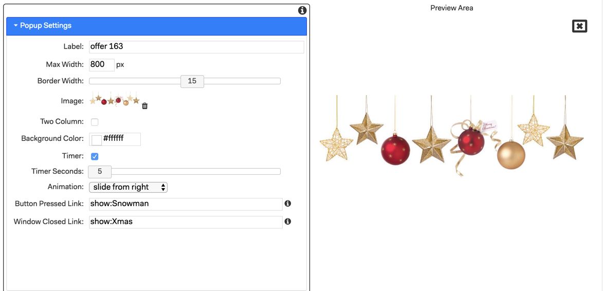
Label - Add a label for the section to help identify it in the builder
Max Width - The default width of the pop-up window is 300 px you can choose a setting to suit your desired layout.
Border Width - This adds a line border to the pop-up window the default is 1 you can choose zero for no border or use the slider to set a width up to a maximum of 30
Image - Add the image you wish to display in the pop-up it will be displayed in the Preview Area.
Two column - Tick this to display the image on the left-hand side and text and other elements to the right. To see the effect publish your app.
Timer - Tick this box to set the pop-up to display after x number of seconds. If you untick the timer option you will need to provide a means of opening the popup such as a Primary button using the link show:name of popup section.
Timer Seconds - sets the delay for the popup to be displayed the default is 10 seconds.
Animation - Choose how you want the pop-up to appear on the screen from the dropdown list. Choose from Popup, the default, and slide from left, right, top or bottom.
Button Pressed Link - Set the link to App section that will be displayed when the button is pressed in the format show:sectionname. For example, it could return you to the top of the app a different page or even a thank you message.
Window closed Link - Set the link to the App section that will be displayed f the close pop-up cross s clicked. For example, it could return you to the top of the app.
2. Title Settings
This is where you can add a title and subtitle to your popup.
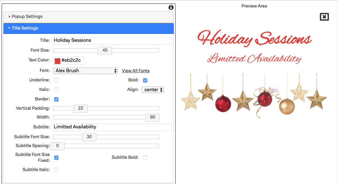
Title - Type in the title text
Font Size -Adjust the font size or the title, the default is 36
Text color - Type in the hexadecimal color to match your brand color scheme or choose from the color picker. The color applies to both the Title and Subtitle.
Font - Select the font for the title & subtitle text
Underline - Tick to underline the title text
Bold and Italic - Tick the boxes to choose these settings for the Title.
Align - choose from left, center, right or justify for the title and subtitle alignment.
Border - Tick to add a line border around the title & subtitle.
Vertical padding - Slide to add space above and below the Title and increase the height of the border
Width - Slide to adjust the width of the Title and the Border.
Subtitle - Type in the subtitle text.
Subtitle Font Size - Sets the font size 16-18 works well for body text.
Subtitle Spacing - slide to add space above and below the subtitle
Subtitle Font Size Fixed - Tick this box to have the device the app is viewed on set a proportional size for the subtitle font.
Subtitle Bold and Italic - Tick the boxes to choose these settings for the Subtitle.
3. Text Settings
The text menu lets you add a paragraph or two of body text to your popup and works in the same way as the Document Section.
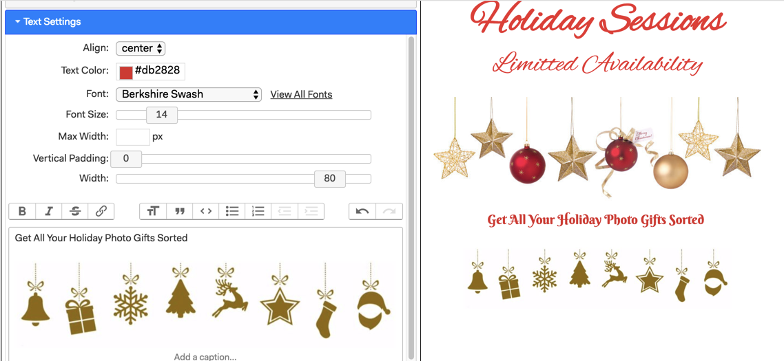
Align - choose from left, center, right or justify for the text alignment, by default left
Text color - Type in the hexadecimal color to match your brand color scheme or choose from the color picker.
Font - Select the font for the text.
Font Size - Adjust the font size for the text, by default 18.
Max Width -Set the max width of the text block within the popup.
Vertical padding - Slide to add space above and below the text
Width - Slide to adjust the width of the text section, the default is 80
Format toolbar - As with a traditional Document section you can choose from the various format options for your body text in the usual way. You can even drag and drop a jpg image into the text box if you want such as a decorative separator.
4. Button Settings
This is where you can choose the design and elements of the Button used to submit the data form
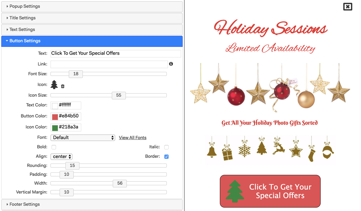
Text - type in any text you want for the button.
Link - add a link to the button, for example to your home page
Icon - Click to choose a button Icon.
Icon Size - Use the slider to adjust the Button icon size the default is 18
Button Font Size - adjust the size of the text font and icon size.
Text, Button & Icon Color - Allows you to set an individual color for the button text, button, and icon.
Font - choose the font for the button text
Bold and Italic - Tick the boxes to choose these settings for the Button text.
Align - choose from left, center, right or justify for the title and subtitle alignment.
Border - Tick to add a line border around the Button.
Rounding - Adjust the rounding on the button, the default is 10
Padding - Add padding to the button, the default is 10
Width - Adjust the width of the Button and the Border the default is 60.
Vertical Margin - Set the amount of space above and below the text of the Button.
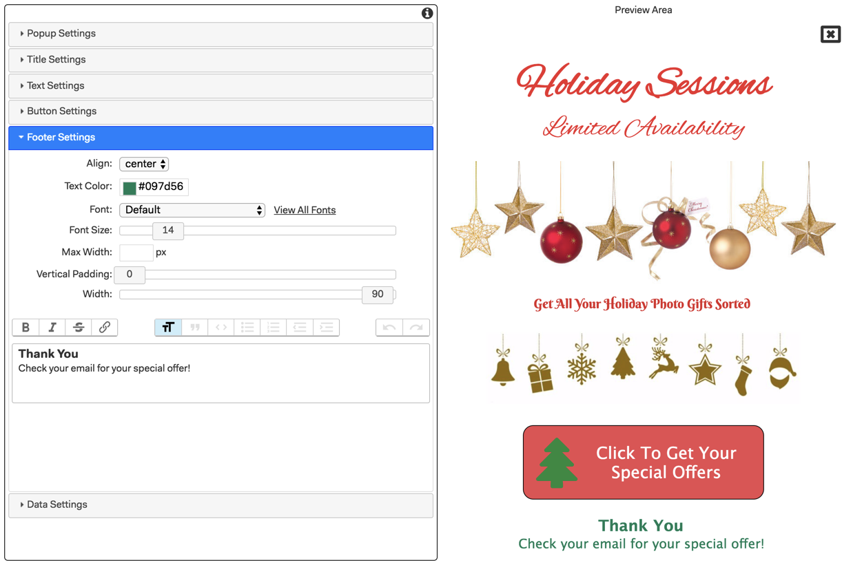
5. Footer Settings
The Footer settings are also based on the document section and the settings are exactly the same as for the Text settings. It allows you to add a combination of text and jpg images to create a footer that will appear at the bottom of the Pop-up. You could create a graphic in Photoshop or simply add a combination of text and images.
6. Data settings
In this menu, you choose what personal data you wish to collect from the form on the pop-up. You can choose from the following 3 options:
Name - Email - Phone
The default prompt will be displayed unless you change it. By default, each field you add is a required field that must be completed before the form can be submitted but you can choose to make some or all of the data fields optional by ticking the relevant box beside each option.
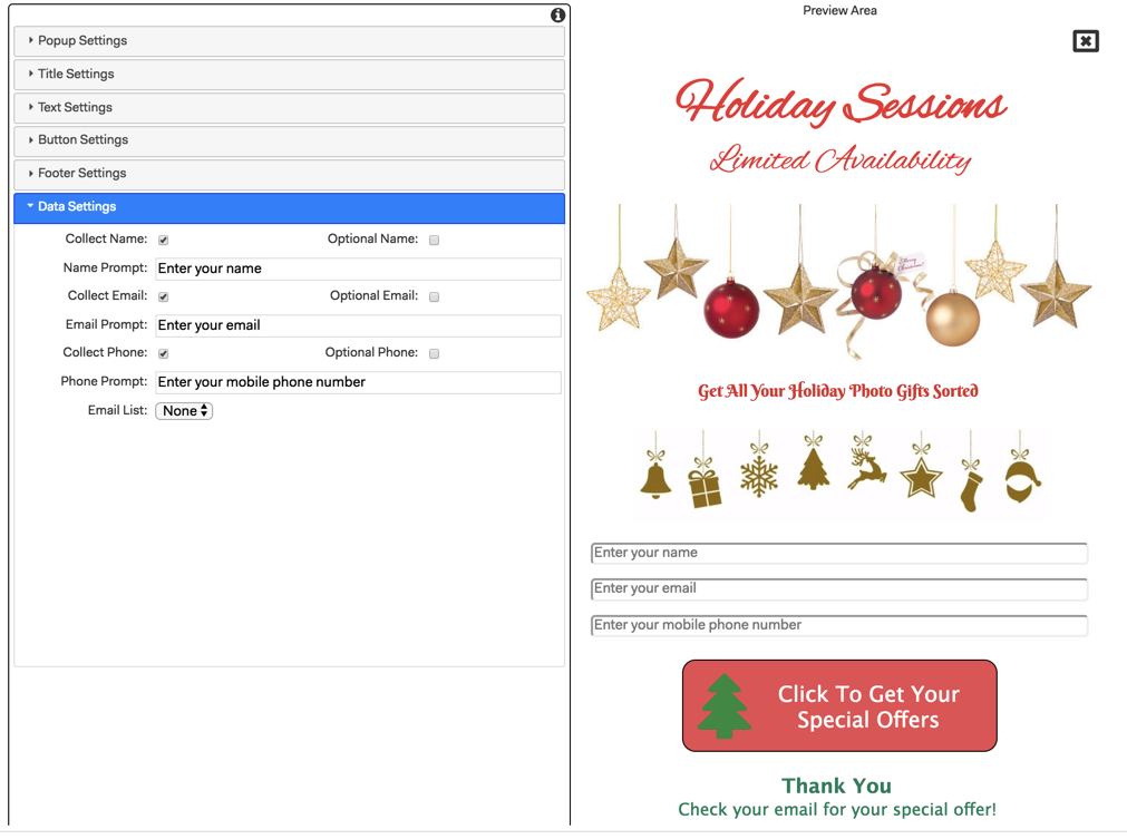
Once you have selected the data fields to be included you can optionally choose to add the data submitted to an available MailChimp list. To do so you will need to first link the MailChimp list to your MPA account in the Setup tab in the builder. It will then appear in the drop-down list otherwise this will be set to none. It's a good idea to create a new MailChimp list for each campaign you create.
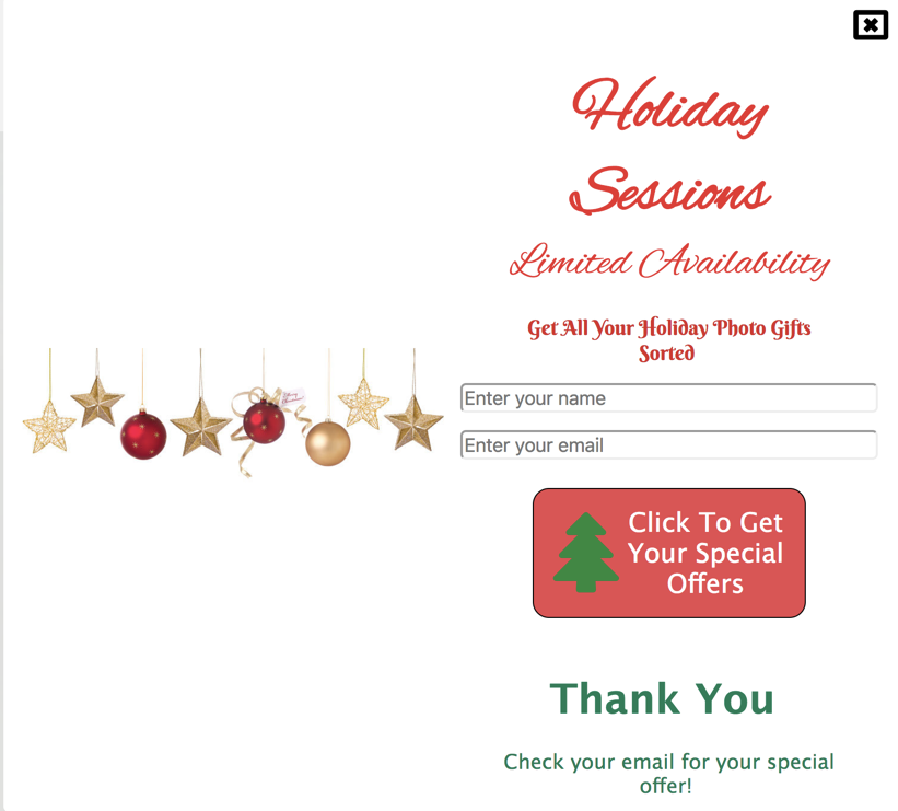
Preview Area
As you add details to each settings menu they will be displayed in the preview area like this.
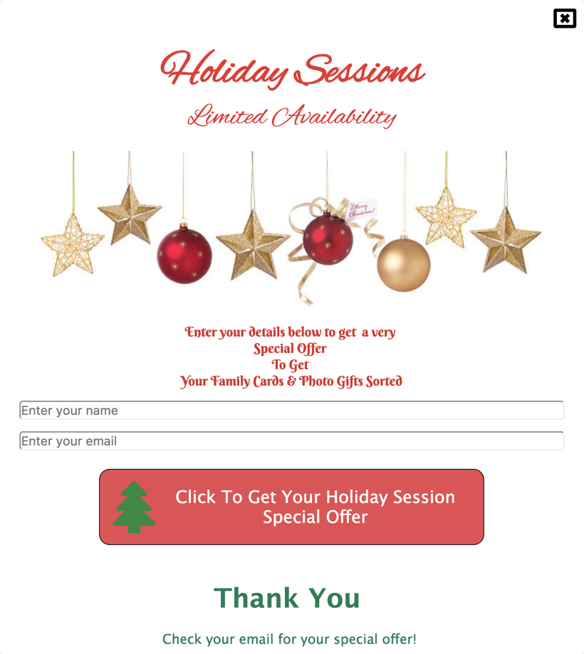
All you need to do now is publish your app and check out the popup section. When information is submitted it sends it to you via email and stores the data on the forms tab.
Here is a sample App with a popup section for you to check out