 |
Need a knowledge base like this for your business?
Document Section
 | By Kim Dixon, MyPhotoApp Training Guru Created: November 22, 2016, 5:15 pm UTC Last updated: February 14, 2019, 3:54 pm UTC |
The document section is designed to let you easily compose beautifully formatted text in your web applications. Documents can be composed of both words and images in jpg or png format.
1. Click On Document Setting to choose how your text will look.
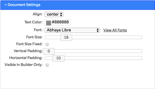
Alignment - choose from Left, Centre, Right or Justify
Text color - Set the text color using the color picker or by entering the hexadecimal # to match your brand. You can choose different colors for words or text and the color you choose is applied to all text in the document section.
Font - choose a font from the list or by typing the name, recently used fonts will appear at the top of the list.
Font Size - Set the font size, you can change the baseline text size of the document, but not individual words. You can increase the size of a line by clicking the TT Heading button on the document toolbar.
Font Size Fixed - Ticking this box specifies a fixed font size and sets the font to a particular Point size across devices and let the devices figure out how best to display it. This is recommended to help keep your layout proportionally sized across devices.
Vertical Padding - Adds space above and below the document section.
Horizontal Padding - Adds space to either side of the document section.
Visible in Builder Only - If you check this the document section will only be visible in the builder and not visible when the App is published. This is useful if you are creating a template and want to add some instructions for people to view in the builder.
2. Click on Other Settings to choose more settings.
Label - Add a label for the document section to make it easier to identify in the builder. The label is also used as the heading if you choose to set accordion display type.
Label Color - This is the color the heading will be when accordion display type is set.
Label Font Size - Sets the size of the heading when accordion display type is set.
Display - The default is Visible, choose Visible or change to Hidden when accordion display type is set and hidden when the display type is set as dialog.
Display Type - Normal is the default, the document will appear in the App. Change to accordion to make the document visible or not by clicking the label heading if Display is set to normal the document will be visible when the App is opened and can be hidden by clicking the heading. If Display is set to hidden only the heading will be visible when the App is opened, clicking it will display the document or hide it again. When set to Dialog the document section can be used as a pop-up dialog for a link in another section.
Background Color - Sets the section background color
Background Image - allows you to upload an image to set as the section background.
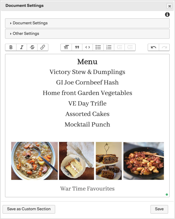
When you have finished choosing settings type your text in the text editor area you can choose additional formatting and other options from the toolbar above. You can even add an image to the document by dragging it into the text editing area.
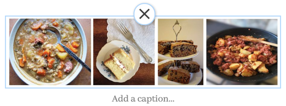
Place the insertion point where you want the image to go and then drag and drop a jpeg image from your computer into the text editor section. Click the image and then on Add a caption ... to add your own caption which will be visible below the image in the App. Captions can also help to boost SEO if you have added an SEO section to your App. Click the Cross above the image to delete it.
The document section is designed to provide an easy way to add paragraphs of text with the ability to add simple headings. If you want to have more variety and create a block of text in your App with different text size and colors you can do this by combining title and document sections in the App to achieve what you are after. To make it easier to organize multiple sections within the builder you can add them to a group section.
If you need even more control, such as the ability to control the size or color of individual words, a Text or Markdown Section may be more suited for your needs.
version 8.5