 |
Need a knowledge base like this for your business?
Pricing Table Section
| By Jim Cook, MyPhotoApp Inventor Created: January 12, 2017, 3:09 pm UTC Last updated: December 23, 2017, 11:38 pm UTC |
Many websites display pricing for products or services. The pricing table section is a way to display a responsive set of individual columns, referred to as items, that will flow depending on the size of the width of the device that it is being displayed on.
While this is called a pricing table, it can be used for many purposes.
You can add as many pricing items you want to each pricing table section. Each Item has 5 optional elements to choose from:
Title - this will appear at the top of the column as bold text.
Image - you can add a decorative page element or illustrative image here. To maintain size consistency you need to ensure that images added to each item are the same size.
Price - Add the currency symbol and price as you wish it to appear.
Details - Add the details of the item here as a paragraph or list. You can optionally add a simple round bullet point to a list using the tick box on the pricing table settings menu. A new bullet is added each time you press enter to start a new row.
Tip: If you would like to add a bulleted list with an empty row between items you will need to type your bullet list in an external editors like Word with the blank row between each bulleted item and then copy and paste the list into the details field.
Button - You can add a button at the bottom of the Item column with a call to action text label and link, for example, to make a call, send an email or open a scheduling page.
You cannot change the order of the individual elements within the Item column. You do not need to use all the elements and can choose to enter information for those that are appropriate for the table you are creating.
Each pricing table Item you add is an independent column of information and how they are displayed in the App will depend on the screen size of the device the App is viewed on and the settings you have made when setting up the pricing table section.
Flex - This is a new feature Flex basis CCS layout that allows you to specify the initial/ starting width of the pricing table items, before anything else is computed, by entering a minimum value. The value can be either a percentage of the App width or a specific pixel value. Basically, it is the desired width of the individual items or columns.
When this field is left blank the app will determine the best size for each item column based on the content and the device the app is being viewed on.
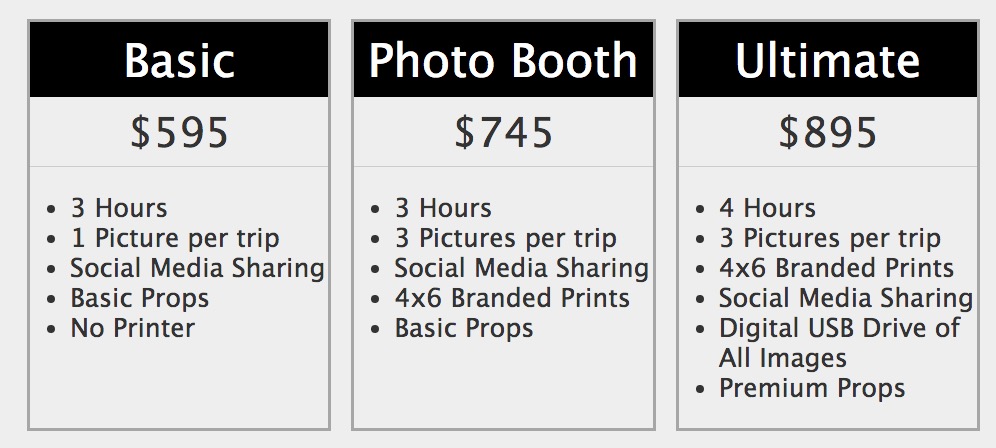
For example, on a website (PhotoBooth in this example), a pricing table with 3 Items, may look like this:

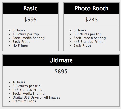
And on a laptop that is narrower, it may look like this:

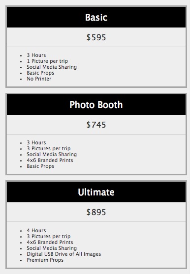
and on a phone it may look like this:

Added Flex Basis value to specify the default width of pricing table columns. flex-basis allows you to specify the initial/starting size of the element, before anything else is computed. It can either be a percentage or an absolute value."
Basically it is the desired width of the item.
version 11.6