 |
Need a knowledge base like this for your business?
Primary Button Section
| By Kim Dixon, MyPhotoApp Training Guru Created: January 16, 2017, 6:59 pm UTC Last updated: December 7, 2018, 9:47 pm UTC |
Primary Button
A Primary Button is a great design element that allows you to have a large single button on a line in your app/website. It is particularly useful as a call-to-action button because of the control you have over the size and other elements.
You can add more than just a text label to a primary button and gives you more control over the look and size of the button. You can add up to three elements:
- An icon
- Button Text
- SubText
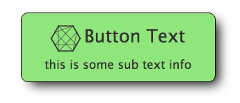
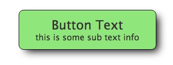
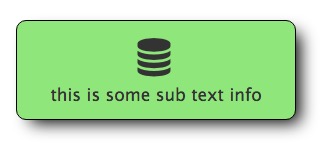
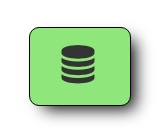
All of the elements are optional, but you will need to have at least one. Here are some examples of primary buttons:
Button with all 3 elements.

A button without an icon:

A button without button text, but with subtext:

A button with just an icon:

Click the Primary Button or the settings cog in the Layout sections to edit the button text and other settings.
You have a large amount of control over each element in the primary button including size, color, padding, border shadowing making it a strong feature in your App.
You can also add horizontal and vertical padding to increases the horizontal or vertical size of the space around the text, as well as a border or a shadow effect.
As with all the Button sections, you will need to add a link to your Primary Button to perform the intended function. You can use any of the usual MyPhotoApp link syntax such as to open a form or show a particular section or navigate to your website or another app.