 |
Need a knowledge base like this for your business?
Welcome Section
 | By Kim Dixon, MyPhotoApp Training Guru Created: August 9, 2017, 4:21 pm UTC Last updated: November 25, 2018, 11:11 pm UTC |
The welcome section lets you add a "pop up" display that appears before the app is opened. The welcome section is a behind the scenes section and it doesn't matter where you position it in your App as the content will not appear in the visual design. Therefore to view and test your welcome section you will need to publish the App. You should only have one welcome section in an App and it's usually best to position all non visible sections at the bottom of the sections in the layout sections column.
The Welcome section can have several uses:
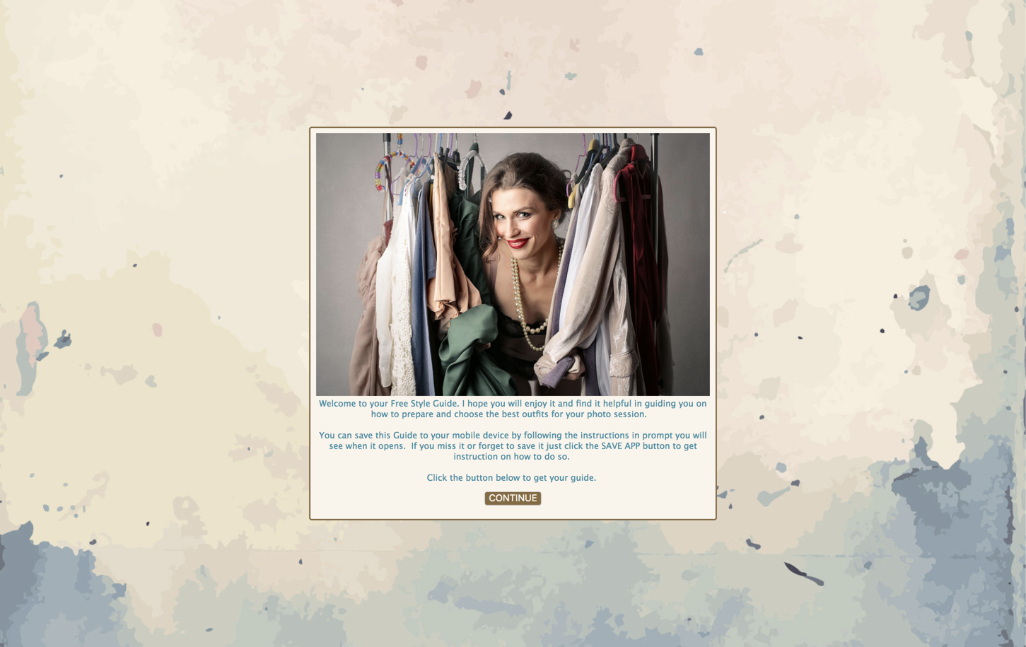
1. To provide people with a welcome message
You can use the welcome section to provide useful information you want people to see as an introduction prior to the App being opened when they click the welcome section button. This does not require them to do anything other than click the button to access the app.
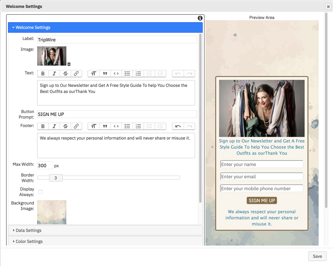
2. To create a tripwire sales funnel and solicit contact information
One of the most useful feature of the Welcome Section is that it allows you to require people to provide their contact details as a condition to open the App and gain access to the content.
Here is an example of a welcome section set up in this way:
Setting Up The Welcome Section
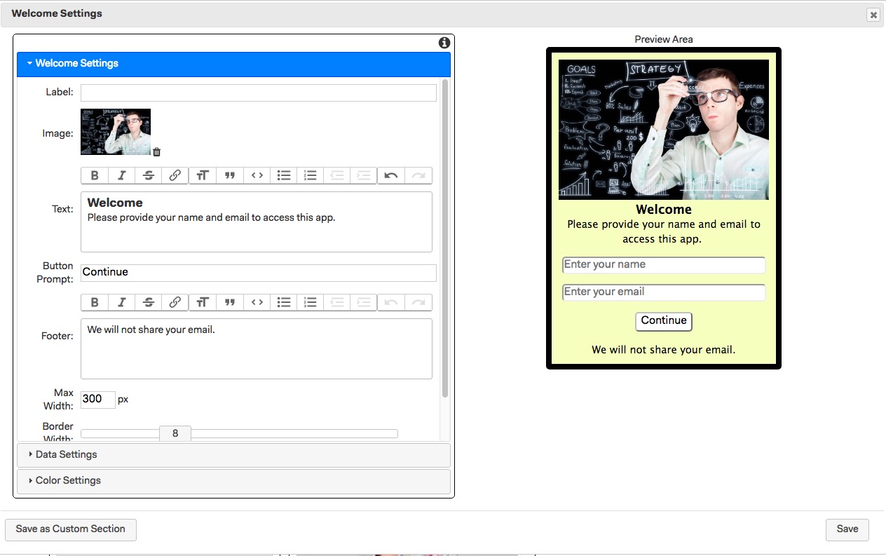
Once you have added a welcome section to the app click on the Settings cog to open the Welcome Settings menu.
This is where you can add the various elements and information you wish to display and can include a hero image, text message, footnote and a background image.
Label: Start by giving the section a unique name so its easy to find in the Layout sections column
Image: Optionally upload a hero image that will be displayed at the top of the welcome pop-up
Text: Add the main text you want to appear in the pop-up - text will appear at the top of the pop-up or below an image if added.
Button prompt: the default Button Prompt is submit but you can customise it here to a more suitable one such as confirm, sign up, open etc.. When they click the button the pop-up window will close and the form will be submitted.
Footer: Add any footer text which will appear below the button. This is ideal for reassuring people you will treat their personal data responsibly if they sign up.
Max Width: the default is 300px but you can choose to increase this to say 600px or 1024px.
Border Width: by default set to 1 you can increase the width of the border that appears around the pop-up.
Display always: by default the welcome section is only displayed once, even if you republish the app. You can choose have it always display by ticking this option. This is particularly useful if you want to use a Marketing App on social media as a trip wire to collect leads.
Background Image: You can optionally choose to upload a background image to be displayed behind the popup window.
Close Button: Ticking this option will add a X close button in the top right hand corner of the Welcome pop-up window. Clicking the close X will close the pop-up and display the App. Note: if you have required contact data to be filled in and submitted to gain access to the App you should NOT tick this box as adding a close button will OVERRIDE this requirement and go ahead and open the App.
Data Settings
This is where you can enable the 'trip-wire' feature and decide which contact information you require by ticking the relevant boxes.
When you opt to collect any contact data they will only be able to access the App once after they have entered the required details in the welcome section data form and pressed the button.
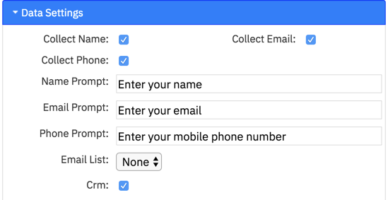
You can choose to require any or all of the following contact details by ticking the box next to it:
- Name
- Phone
Prompt: Once you have decided which data to collect you can change the prompt that is displayed for each of the 3 contact options.
Email List: If you have opted to collect an email address, whihc is probably the most important data to collect, you can also choose to automatically add the email to a MailChimp account list
CRM: You can also choose to automatically add the email as a new client record in the CRM module when they submit the welcome data form.
An example of how this might work is if you offer a free style guide to your portrait clients but in order to get it they need to sign up to your mailing list or newsletter first.
When you have required dat to be provided clicking the button without doing so will produce an error message telling them to enter the missing data.
Color Settings
This is where you can choose the various color settings for the welcome pop-up
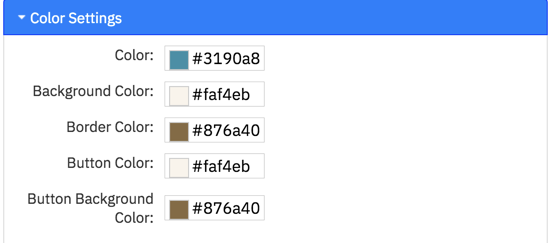
Color: set the text color for both main text and footer
Background Color: Sets the color of the background of the pop-up window
Border Color: Sets the color of the border that is shown around the pop-up window.
Button Color: Sets the color of the Button text
Button Background Color: Sets the color of the Button.
When you have finished setting the Welcome Section options click SAVE to update the settings.
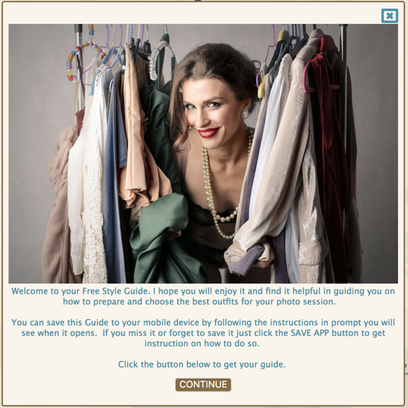
You can now Publish your app to view and test your Welcome Pop Up. Here is an example of the trip wire Welcome section i have used in the above screen shots as viewed on the computer. I have set the Max width to 800px in this example.

And here is an example of an intro style Welcome pop-up