 |
Need a knowledge base like this for your business?
The Image Section
 | By Kim Dixon, MyPhotoApp Training Guru Created: November 22, 2016, 4:56 pm UTC Last updated: January 22, 2019, 6:42 pm UTC |
The Image section allows you add images to your App it differs from a Gallery section in that it is designed for a single image and enables you to make changes to the image you upload.
The Image section is a powerful tool in your Apps as you can:
- Modify the look of the image in terms of opacity, brightness, grayscale or blur
- Add a Title overlay on the image which can also include an animate effect.
- Add more text using the new document settings
- Add a link to the section so it performs an action like displaying a gallery or page section when the image is clicked allowing images to become an interactive element in multi-page Apps or a link to an external website or resource.
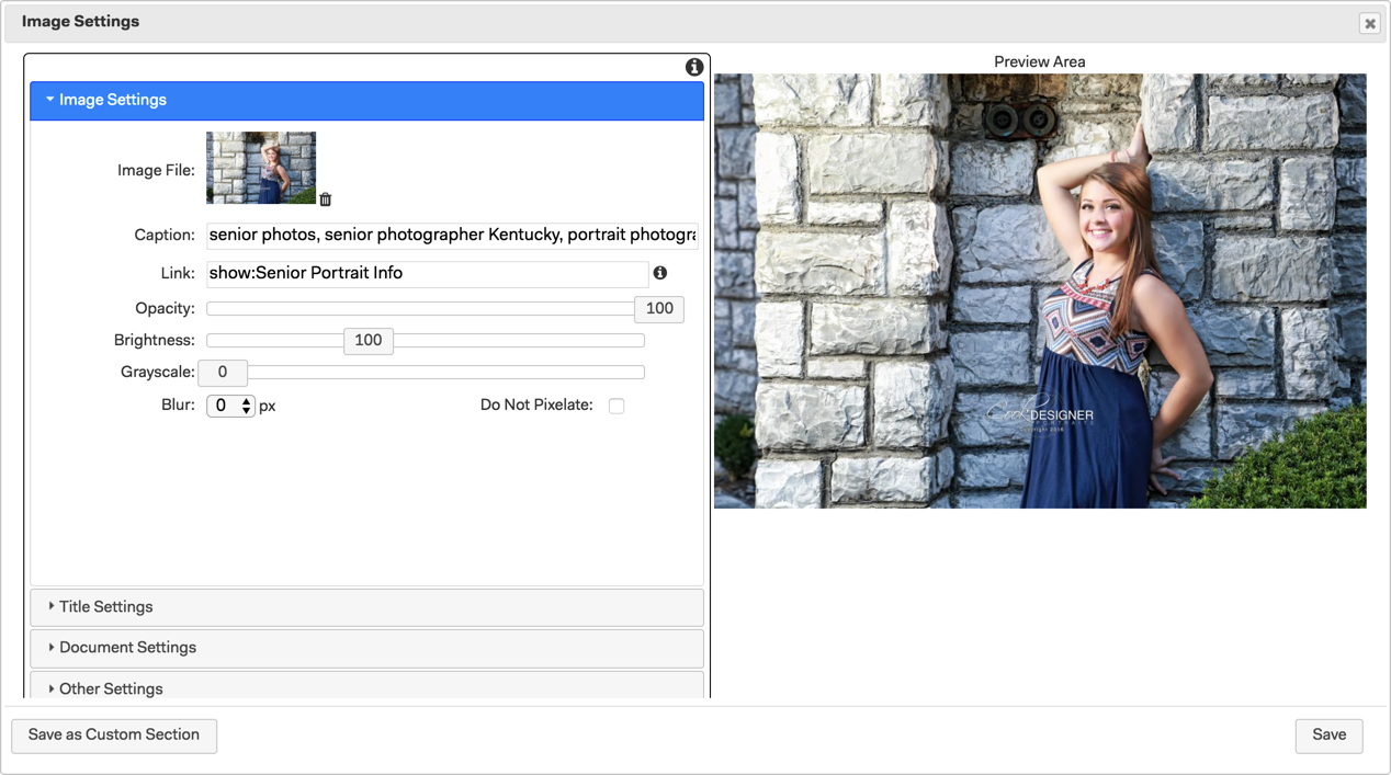
1. Once you have added your new image section just click to upload the image or click the settings cog to go to the image settings to upload an image. You can also drag and drop an image file onto the section. The image section supports jpeg, png and gif file formats and a maximum size of 2048 px. Images uploaded with a pixel dimension less than 2048 px will be saved at their original size any images larger than 2048 px will automatically be resized to 2048px. You can upload images to be automatically resized to 2048 px up to a maximum file size of 15mb, attempting to upload images larger than this will cause the upload to fail. Images are compressed when saved to the server.
For maximum quality control and minimum compression, you should export your images to a suitable file format with a pixel dimension of 2048 px on the long side before uploading.
Caption - Add keyword tags separated by commas here to help your Apps SEO, essential if you have added an SEO section to your App.
Link - Type in the link you want your image to go to when clicked. this could be another section, a page as in this example or an external resource.
Opacity - 100 equals full opacity move the slider to the left to reduce the opacity of the image.
Brightness - 100 equals normal, as uploaded, slide to the left to reduce and to the right to increase the brightness of the image.
Greyscale - No need to convert your images to standard Black & White as you can now use the greyscale slider to do so, 0 equals full color saturation slide to the right to increase the level of desaturation and reduce color, 100 equals full greyscale.
Blur - Choose from 0 for no blur to 10 for maximum blur
Do Not Pixelate - Images will automatically scale to the size of the device they are viewed on. If you upload an image that is smaller than the width of the device it is being viewed on it will appear pixelated when it fills the screen of the device. Tick this box to restrict the size of a low-resolution image on larger screen devices to ensure they do not pixelate. When that option is selected, the image will scale to the natural size of the image and then stop growing and be centered in the App.
2. Next click on the Title settings to add a text overlay to the image. You can add both a Title and a Sub Title if you want. The settings are laid out in a similar way to the Title Section.
Title - Type in the title text.
Font Size - Adjust the font size.
Text Color - Type in the hexadecimal color to match your brand color scheme or choose from the color picker. The color applies to both the Title and Subtitle.
Font - Choose your font by scrolling down the list or by starting to type the font name. Your frequently used fonts will appear at the top of the list.
Bold and Italic - Tick the boxes to choose these settings for the Title.
Title Border - Tick to add a line border around the Title and Subtitle.
Title Animate - Tick this box to add animation to the tile so that when a mouse hovers over the title it will be highlighted black. This is a great way to create a mock button on your image if you have added a link to it.
Vertical Position - Choose the vertical position of the Title.
Horizontal position - Leave at zero to center the Title or adjust the slider to position the Title where you want.
Title Width - Slide to adjust the width of the Title and the Border.
Title Fill - Adds a white or black rectangular fill behind the Title & Subtitle according to the title width set. A value of 100 adds none, moving the slider to the left to reduce the value and increases the level of black fill and moving the slider to the right increases the value and adds white fill. If you specify a title background color, then that color will be used instead of white/black.
Subtitle - Type in the subtitle text.
Subtitle Font Size - Sets the font size.
Bold and Italic - Tick the boxes to choose these settings for the Subtitle.
Title Background Color - Lets you specify a color background for your title.
Banner - Instead of the title being a box on the image, it will be housed in a vertical area that fills from the top to the bottom of the image. Sort of like a ribbon on your image.
Motion - When selected, the title will be invisible and will fade in and move from left to right to its proper position when the image is visible. If the image is visible when the app opens, it will appear in 1 second. Otherwise it will appear when the app is scrolled to reveal the image. This effect only happens once and once the title is visible, it is always visible.
The text will scale based on the size of the device so you will get a consistent look across all devices that use the App.
3. Click on Document Settings to add a paragraph of text as an overlay. This is really useful for creating a banner image with a paragraph of text, similar to what you see on websites. It is ideal for creating a more detailed call to action or as a means of adding text combined with a Title and custom image background with the bonus of being able to make it interactive using a link. It is ideal for Apps designed to be viewed full screen on computers such as landing pages or websites. It works particularly well on a panoramic image with an aspect ratio of 2:6 where you have created negative space to hold the text like this:
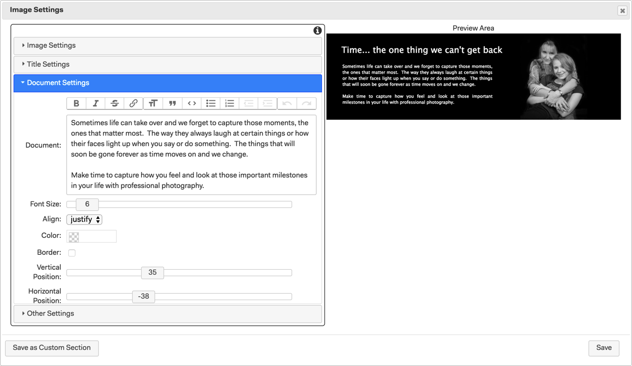
The document settings work in the same way as they do in a standard Document Section:
Document - type your text in the text editor section and choose formatting and other options from the toolbar. You can even add another image to the document by dragging it into the text editing area.
Font Size - Set the font size for the text.
Alignment - choose from Left, Centre, Right or Justify
Font color - Set the font color using the color picker or by entering the hexadecimal # to match your brand.
Border - Tick to add a line border around the document Text.
Vertical Position - Choose the vertical position of the Document text.
Horizontal position - Leave at zero to center the Document text or adjust the slider to position the Title where you want.
Title Width - Slide to adjust the width of the Document text and the Border.
Title Fill - Adds a white or black rectangular fill behind the Document text according to the width set. A value of 100 adds none, moving the slider to the left to reduce the value and increases the level of black fill and moving the slider to the right increases the value and adds white fill.
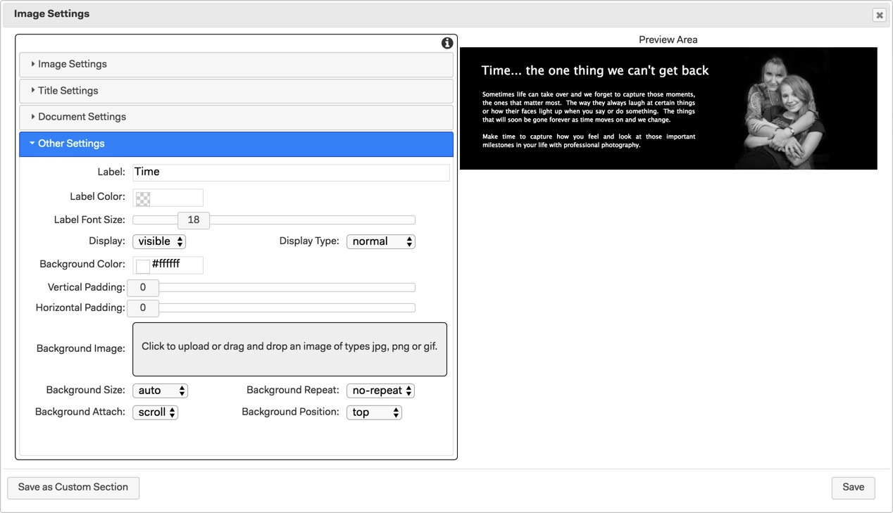
4. Finally, click on Other Settings to add a label for your Image section that will make it easier to identify it in the layout settings. You can add vertical and horizontal padding and a background color or image. Once you have finished choosing settings click Save to update the Image section and preview it in the visual design.
5. Time to publish your App and check out the image section to make sure it looks good and any links work as expected.
With the latest updates to the image section, you are now ready to take your Apps to the next level by creating multi-page Apps with Images as the links to more information creating a slick and easy to use interface. Check out the Multipage App template in the Template Bazaar on the Template Tab.
Version 8.5