 |
Need a knowledge base like this for your business?
Text Table Section
 | By Kim Dixon, MyPhotoApp Training Guru Created: December 22, 2017, 6:31 pm UTC Last updated: December 23, 2017, 8:11 pm UTC |
This section is designed to allow you to create a custom table for text where you can control both how the text looks and how the table is laid out in terms of alignment and column size. This is useful where you want to lay out a simple table of options or information. The table layout will be maintained across all devices.
Once you have added a new Text table section click on the settings cogs to begin creating your table:
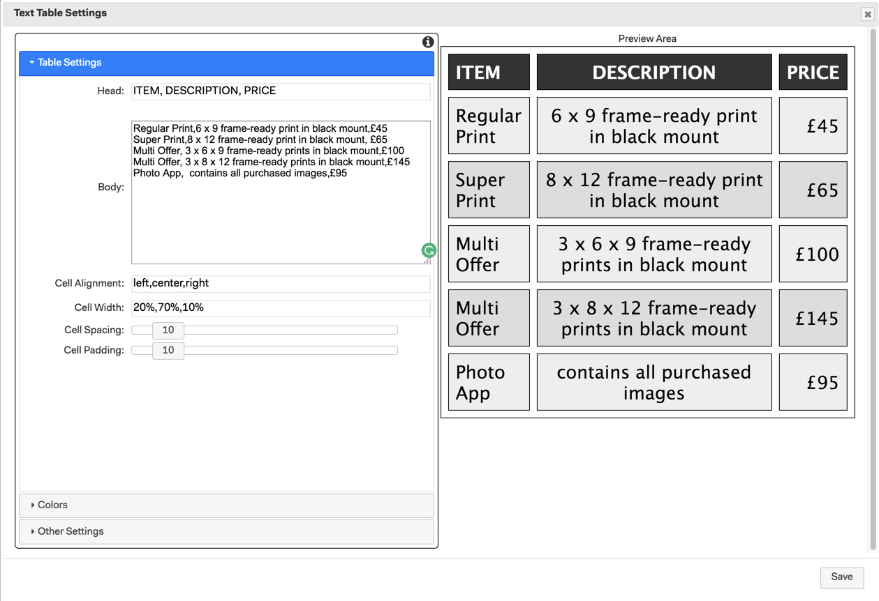
Entering Table Data in Table Settings
This is where you enter the heading title and data for your table and determine the spacing and alignment of the information and columns.
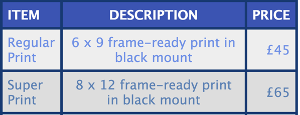
Head: The head (title) is where you add the individual heading or title fields you want for each column of your table. Type in your heading titles separated by a comma. In the example below there will be 3 columns with the heading title ITEM, DESCRIPTION and PRICE.
Body: The body text area is where you specify the data for each individual row of cells you want in the table. Each element for the individual columns is separated by a comma, in the same way as the heading title. To add a new row simply press return and start on a new line.
Cell Alignment: Controls how the content of each column of cells is aligned choose from:
- center
- left
- right
If left blank the default is to center the column content. To specify the alignment for each column, type in the alignment values you want sperated by a comma.
Cell Width: This determines how wide each column is in one of 2 ways:
- using a percentage, for example, 10% or
- a fixed width like 100px.
If no cell width is specified the app will try to use column widths that best fit the data they contain.
Cell Spacing: This adds extra space between the cells of the table when set to zero you will only see the cell border. When you add cell spacing you are adding extra space, which will be the color of the section background and white by default, the cell border will show around each cell.
TIP: if you want to make the cell border appear thicker set the section background color in other settings to the same color as the border and increase the Cell padding until you are happy with the affect.
Cell Padding: Adds extra padding and space around the text in each cell of the table. The default setting is 5.
NOTE: If you need to put in a comma character in your table content you can type in , to prevent the section thinking you are using the comma to separate data.
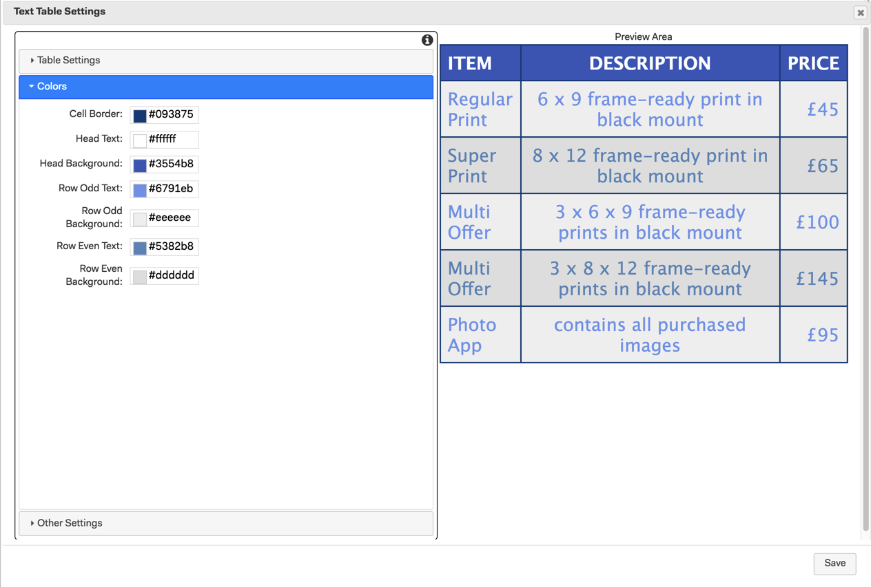
Colors
This is where you can define the color of the different table elements. By default, the colors are a range of greys. To help make the table easier to read you can define different text and cell background colors for the odd and even rows.
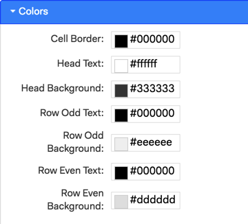
Cell Border: This is the color you will see as the outline of the individual cells
Head Text: The color of the heading title text
Head Background: The background color for the cells in to top row of the table that contains the heading title text
Row Odd Text: The text color in all odd rows.
Row Odd Background: The background color of the cells in all odd rows.
Row Even Text: The text color in all even rows.
Row Even Background: The background color of the cells in all even rows.
Other Settings
This is where you can change the font and size of the text used in the table, the default font at size 18 is set. The heading title text is automatically set as bold and therefore appears slightly larger than the text in the main body of the table.
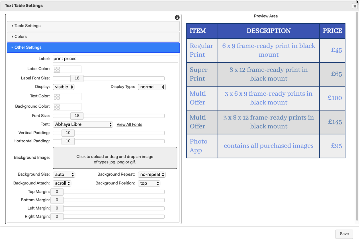
To make sections easier to identify in the builder add a label and then make any other changes you want to the basic section settings. The table will start at the edge of the app unless you add some horizontal padding.
When you have finished click Save to update the section and save your table with the information you have added and the settings you have selected.
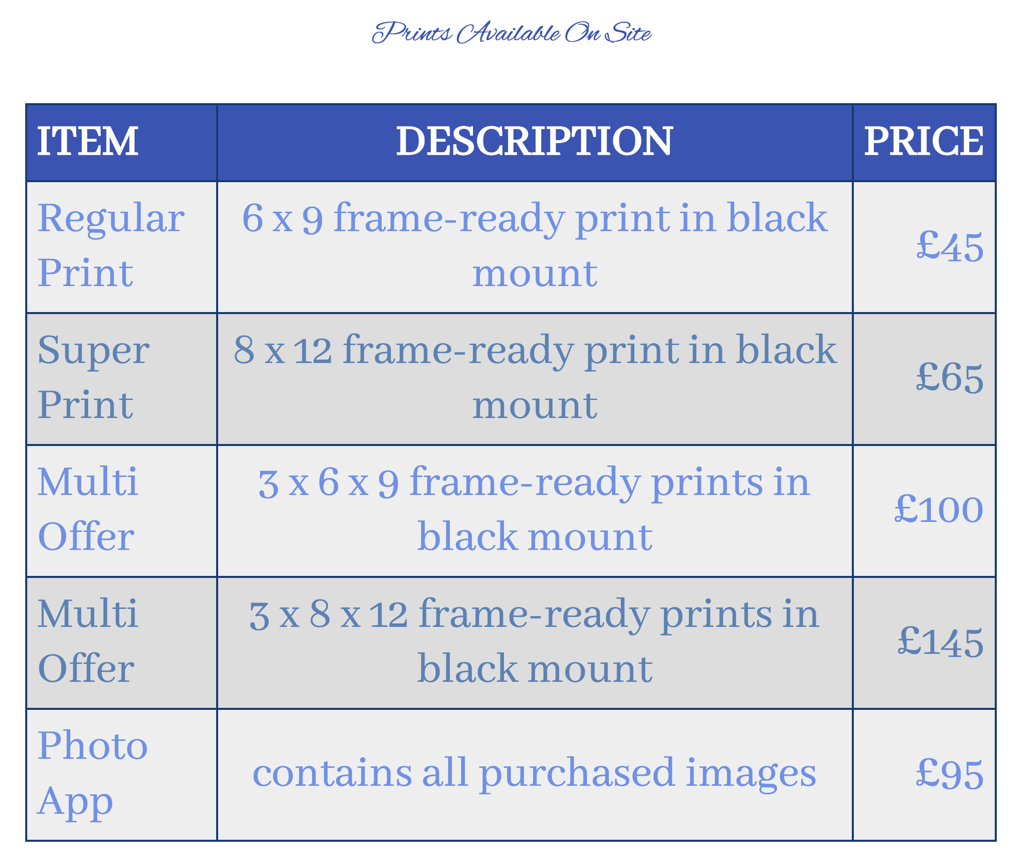
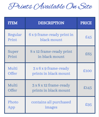
You can now check out how your table looks in the visual design I have added a title section above it.
Finally, Publish your app to check it out on your PC and mobile devices.